The Gehry Building at UTS, Sydney
Review: Dr Chau Chak Wing Building | University of Technology
 Many universities in Australia have campuses with lush landscape settings. Then there are the universities that are very contained inner city urban environments. In Sydney, the University of Technology (UTS) is one of the latter.
The UTS is on a campaign of raising its profile and one very visible part of this is that the university has been upgrading its buildings and facilities. It all adds interest.
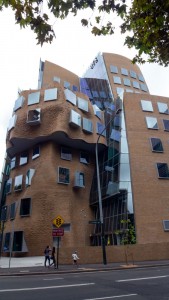 Early this year there was a lot media coverage of the official opening of this significant piece of architecture, Dr Chau Chak Wing Building, designed by Frank Gehry.
Much was made of the fact that this was Gehry’s first building in Australia. According to the media releases this building was to serve multiple purposes including being a tourist destination. Well after all the hype, it was time to catch a train across town and walk across from Central to have a look at this architectural wonder.
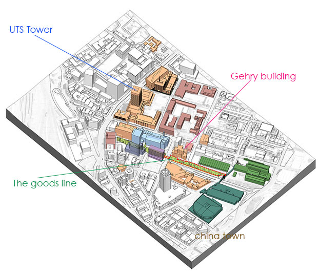
The first mystery was that in all the articles on the building, I could not find no mention of just where it was. It took a while but eventually all was revealed. It was not on a main street but tucked away on Ultimo Road, on the China Town side of Harris Street. Here’s a map I have borrowed and adjusted. (more on the goods line later)
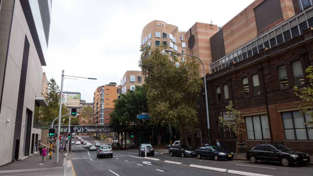
I had somehow come to the conclusion that this building by this famous architect would dominate the main part of the campus. Not so. As you approach from either side the building is not too obvious till you are very close. The street, Ultimo Road, is very much a through street and has very little appeal.
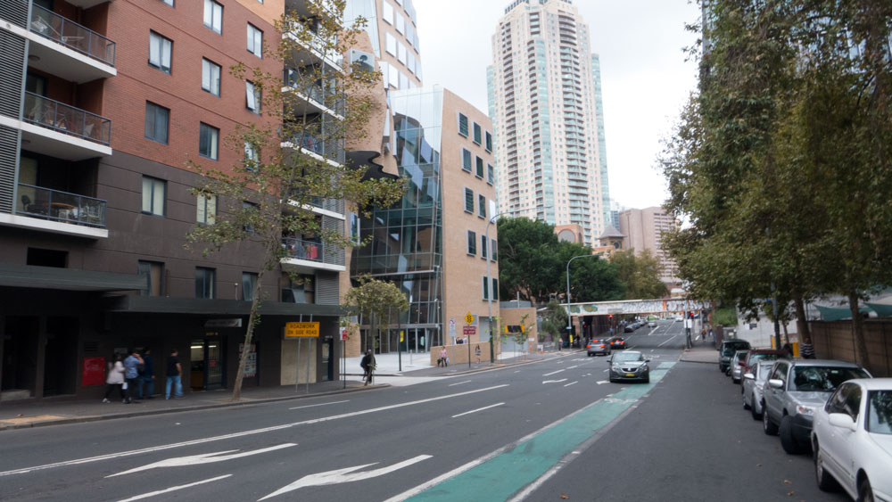 The image above from the corner with Harris Street
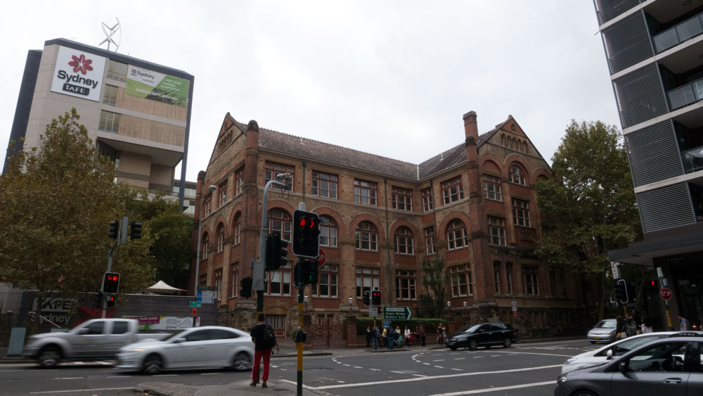
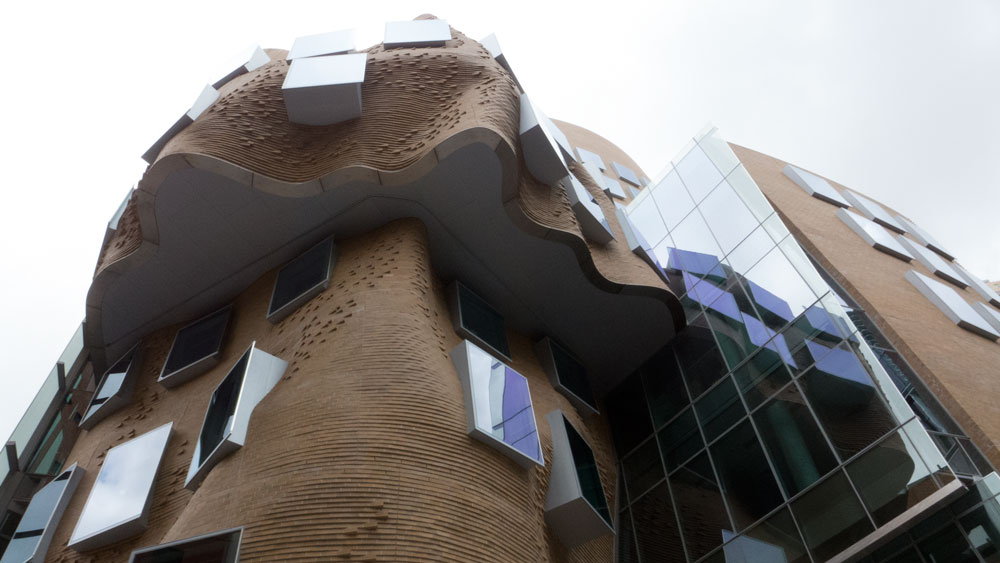
The first thing to be noted the use of bricks for most of the building. This is a good thing in this era of the dominance of glass and steel bland box architecture. I suspect that they claim that it has some relation to this building just around the corner in Harris Street.
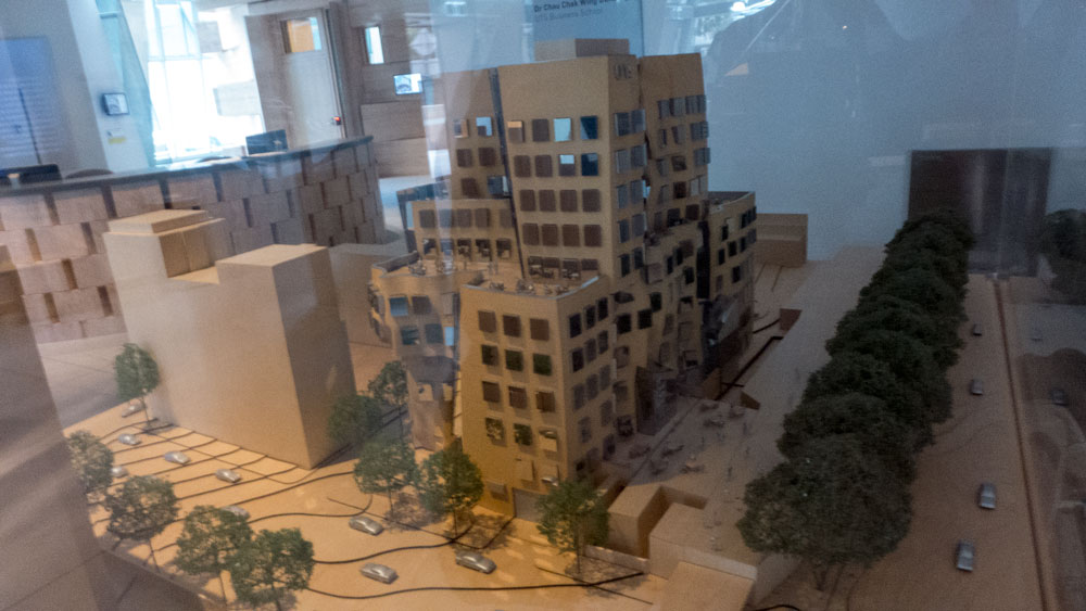
As I said this building is not big. I took this photograph of the model that is still on display inside. And this has been generous with the surrounding open spaces.
In short, this is a medium sized building squeezed onto this back street site.
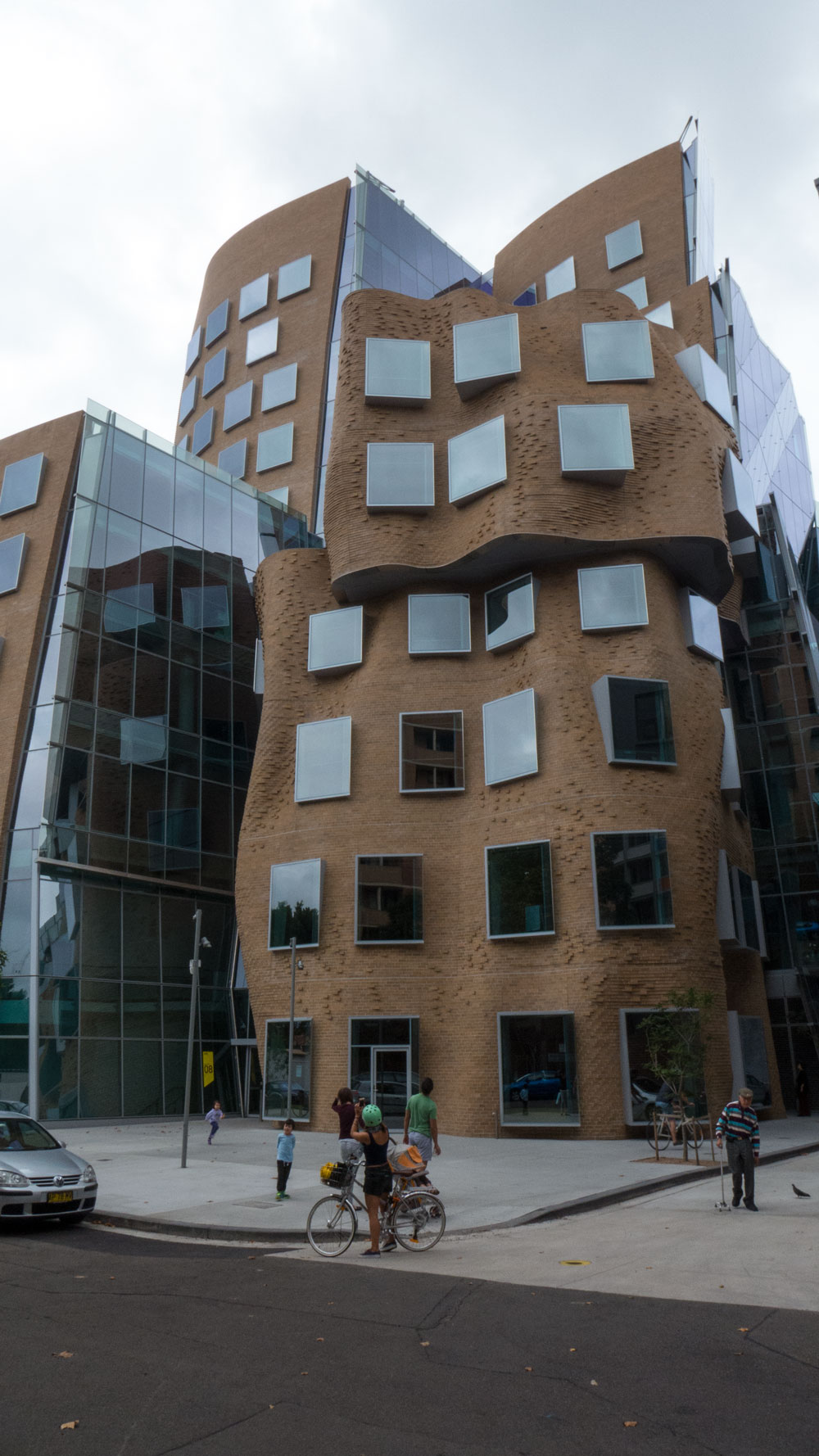
There is much to be admired about the architect’s use of unusual shapes for the walls. The vast majority of buildings in Sydney are of either the usual bland box type or maybe the occasional international style tower. Most of Sydney’s modern buildings are quite boring and have made the city look fairly ugly. So to see this Gehry makes one wish for more unusual buildings.
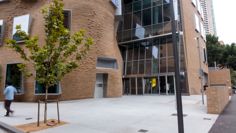
Obviously Gehry does not do landscape or pay much attention to the surrounds. Have a look at this heat island effect forecourt at the front door. One tree! Nice.
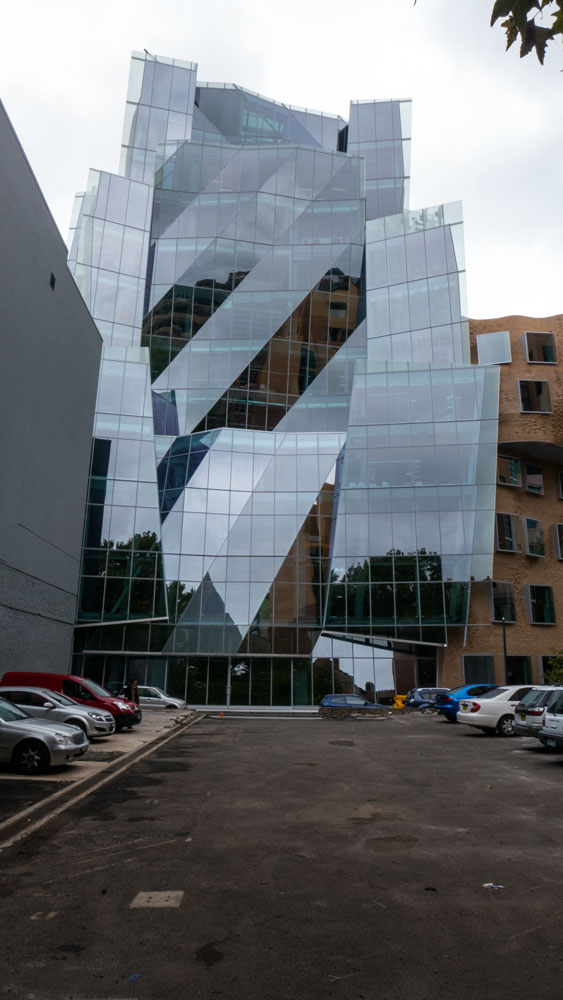
I read how part of the building had made an amazing use of glass. As it turns out, this glass side is in the side lane and one needs to wander into the adjacent vacant block to see it.
Here are an image of the back corner:
and another of the front:
Yes this is an interesting building. No more.
Click here for more on Wikipedia on the building.
There is also been a lot of hype about The Goods Line which was to opened at the same time as the Gehry. This is a linear park that will be 500 metres long and will run behind the Gehry where there used to be a train line for goods. It is running late due to all forms of delays caused mainly by lack of planning of what was involved with this site. I suspect we will hear much of this later as they are already desperately trying to link this small linear park development to the High-line, that major project in New York.
As for going out of our way to see the Gehry, I would not recommend it unless you had other things to do in the area.
How to rate this building?
- As for architecture that addresses the issues around climate change adaptation: This one fails.
- Has it added to the green infrastructure of the neighbourhood: Fail
- Impact on the urban street life: Not much!
- Of interest especially given all the other boring Sydney architecture: Definitely of interest.
Recommendation: Overall Rating 7/10
———————————————-
for more on architecture – click here
Paul Costigan
