Review: Urbanity
New Acton Precinct, Canberra
There was much ado about this whole precinct development when it was being built and this continues through to today. Having visited the site a few times now, to meander, to eat, to meet for coffee and the occasional business, I have to say that it is a very mixed result. It is worth a visit on a busy day to see for yourself. But it does not match some of the rhetoric that has been put about – click here for an example of some project-porn spin*.
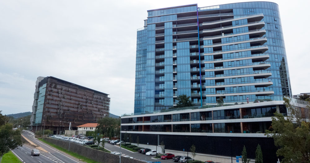
When I say it is mixed I refer to the mixture of landscape and architectural styles in such a smallish precinct. Most of the taller buildings are architecturally of little interest.
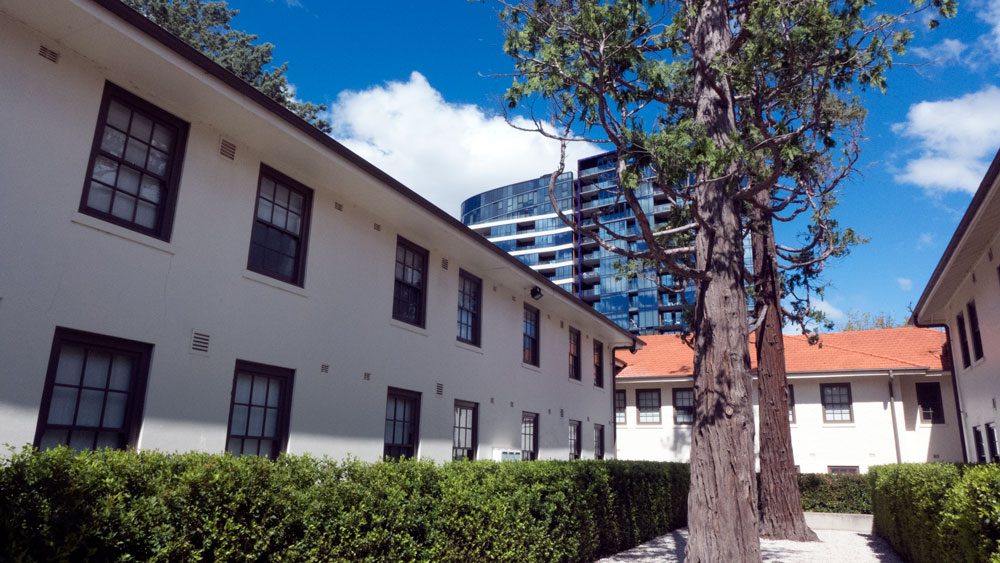
The design of the area had to fit around the heritage buildings that had to stay, although their use was very much modified and done so successfully.
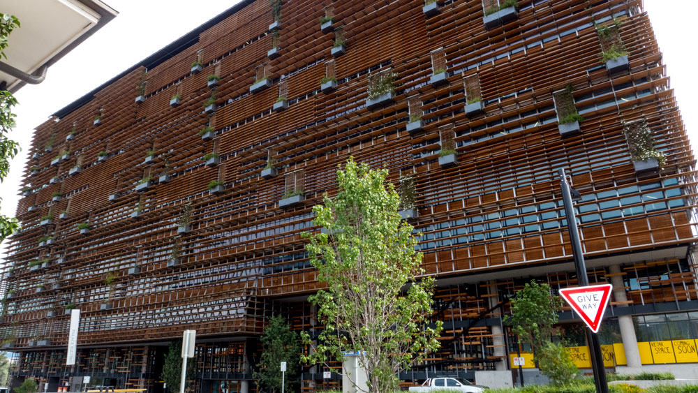
The new architectural styles are only partial successful at best. The largest, the Nishi building is a glass box clad in wooden panels, most of which are showing age already. There’s the now token green bits. These could only be superficial but I am sure they have somehow been lauded as being part of the green star rating.
Other buildings where wood has been used would have looked good on open day but are starting to look a bit shabby as they discolour unevenly.
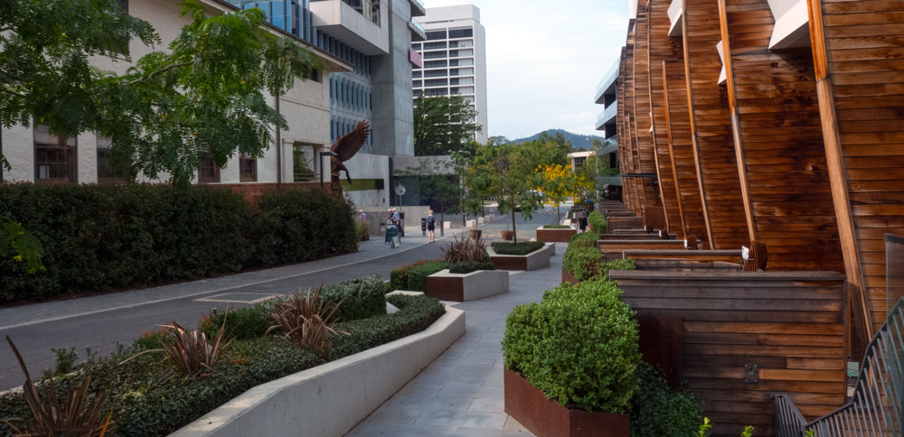
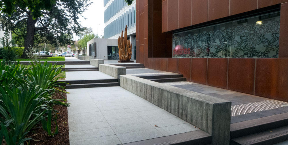
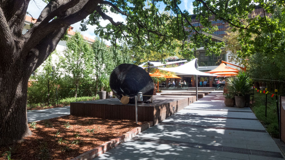
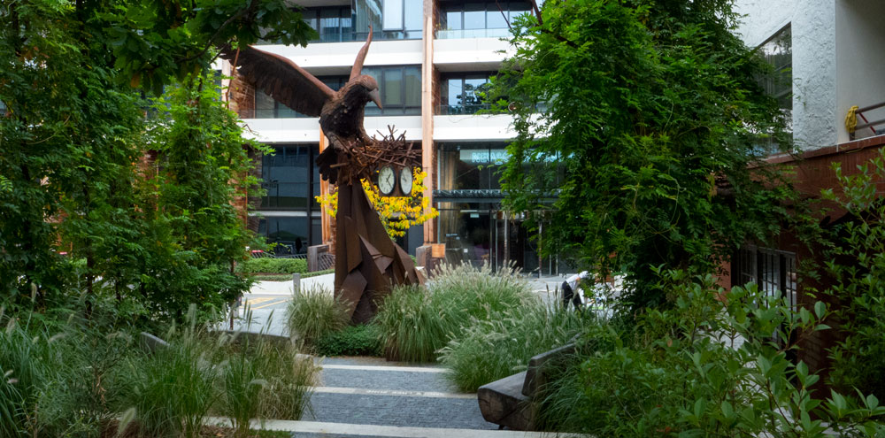
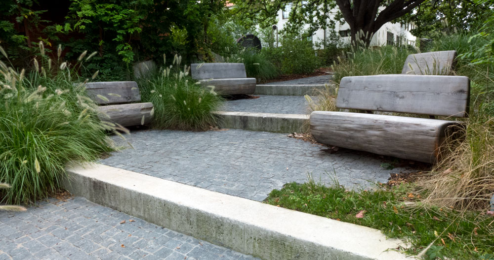
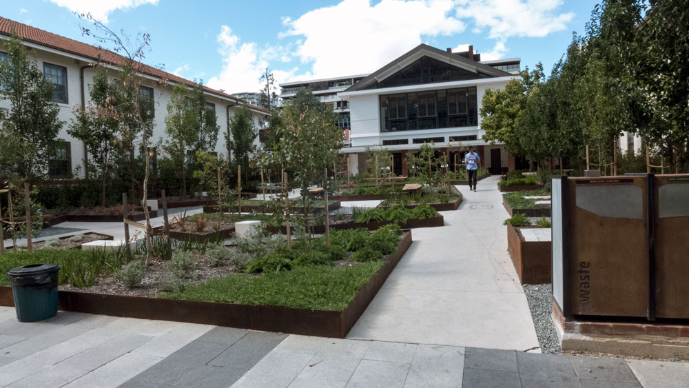
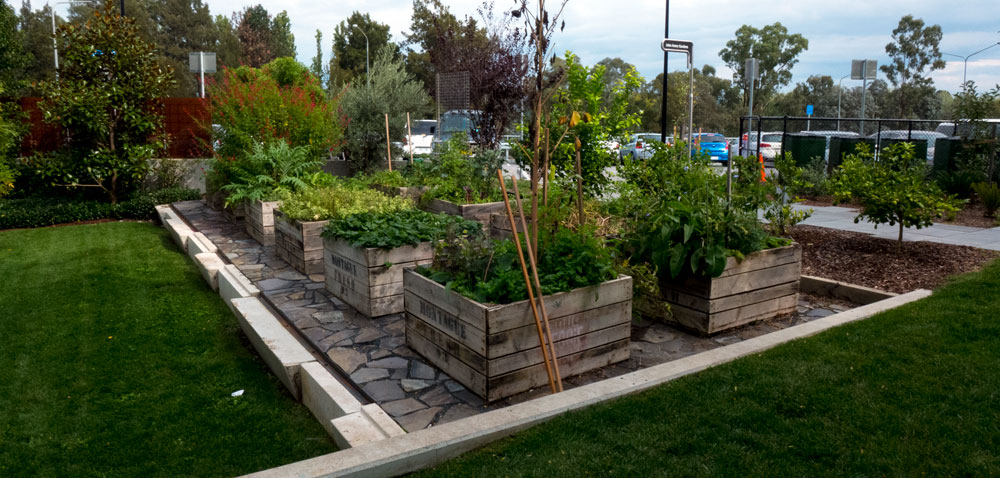
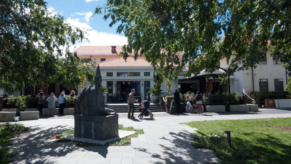
There are some very nice quiet spaces scattered around with what has become standard landscape design treatments. The whole precinct landscape design does not really hang together but at least it improves the site given the architecture and the confused layout of the whole precinct.
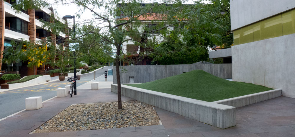
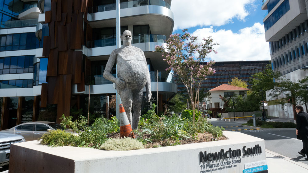
It is as if there were several ideas at work and no-one had overall vision for the site. There are token examples of particular landscape treatments with a few quirky things here and there. Such as this fake grass mound which is a little bit of mystery.
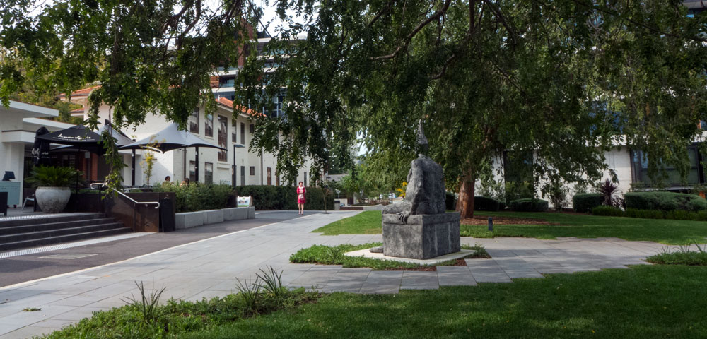
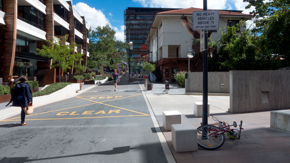
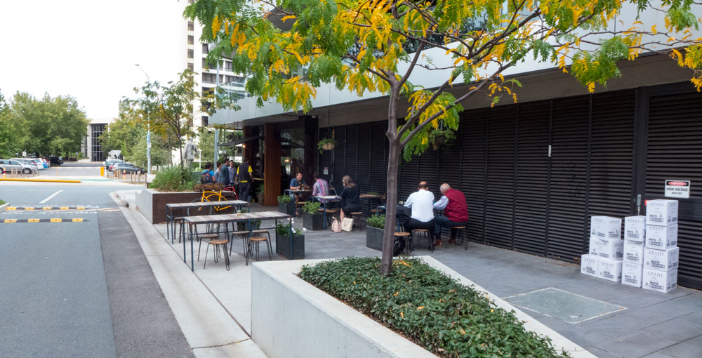
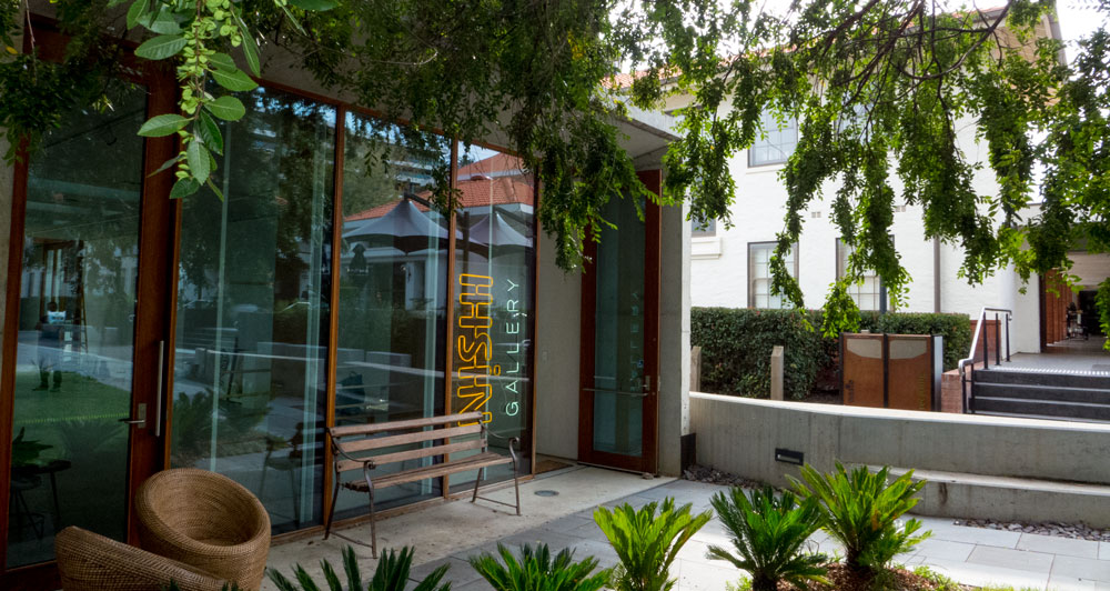
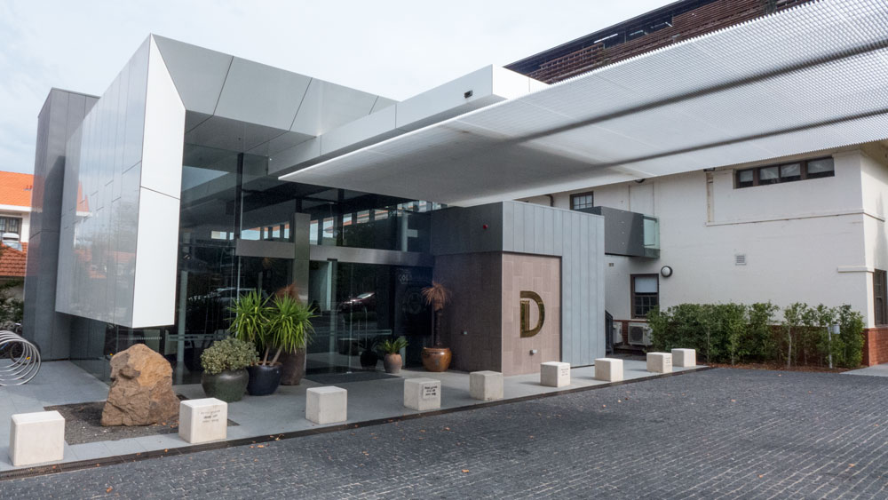
Looking at the above set of images together it looks as though it all works well. The photographs tend to be complementary. The reality is that site has many smallish areas that more like an accumulation of pocket parks with various uses. The whole place has all sorts of uses and pleasant places to hang out but overall it is very bitsy. The mixture of architectural styles and the fill in landscape design delivers a less than cohesive feel to the whole precinct.
The site has numerous cafes and eateries, maybe even too many.
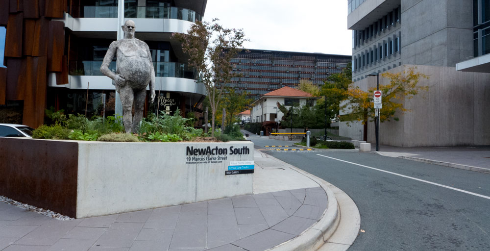
as well a cinema and a theatre – and artworks everywhere. All this adds to the ambience and fun aspects of the site. The formula should have worked well. But not quite.
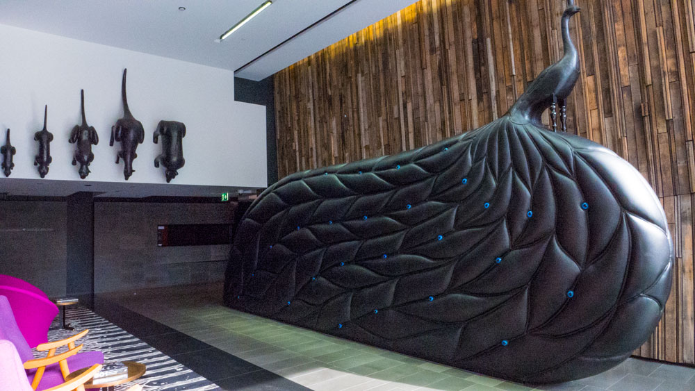
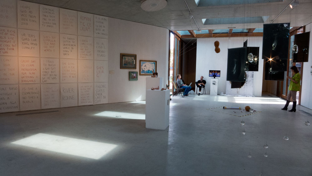
There is also a visual arts gallery – The Nishi Gallery – which is a great initiative. But it is a nice space desperately looking for some much better curatorial directions and better management. A waste of space at the moment.
and there is a very nice hotel on the northern side. I have not stayed there but others have and have recommended it except that you will need a car as it is isolated from anything else.
So overall the precinct is definitely of some interest. Aesthetically the design work is all over the place. There are good bits, some OK bits and boring bits. There are small pocket park like places. One or two (not all) of the cafes are interesting.
All these disparate parts add up to a not well put together precinct that is less than something to brag about. I would not encourage anyone to go out of their way to go there to see the architectural and landscape works as there are much better examples in many other places.
Depending on the time and day, it can be a good place to meet for coffee and a meal. There’s the theatre. There’s a cinema. So there are a range of reasons to go there.
The Visual Arts Gallery – The Nishi Gallery? Now if they would get someone with curatorial knowledge to run a good art and design program through their gallery, then there could be another reason.
Considering all these factors, I have given the whole precinct an Urbanity Rating.
Recommendation: Urbanity Rating of: 6/10.
————————————————–
*Project porn is a term introduced to me by a UK colleague to describe the professional magazine style project write-ups that are typically just professional promotion; often written by colleagues about colleagues; and usually not really critical – being more just for show – as in porn – to be enjoyed by the professions admiring themselves and their colleagues.
————————————————-
Paul Costigan, 17 April 2014
Could you please provide me with any information about the landscaping at the NewActon Precinct involving the use of newspapers for the ‘garden beds’/retaining walls?
I look firward to a reply. Thank you
Helen
This question seems to be about something that is not addressed in the post. Therefore we leave the question to float out there in the bloggosphere in the hope that someone else will understand it and maybe supply an appropriate response.