Review: Embassy Architecture in Canberra
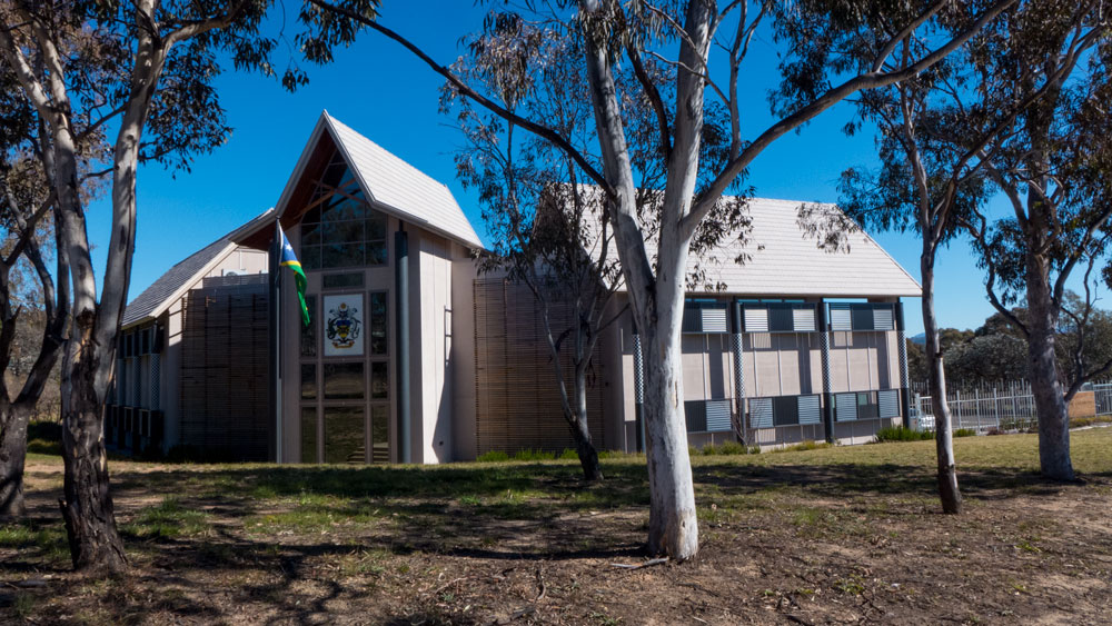
The Solomon Islands High Commission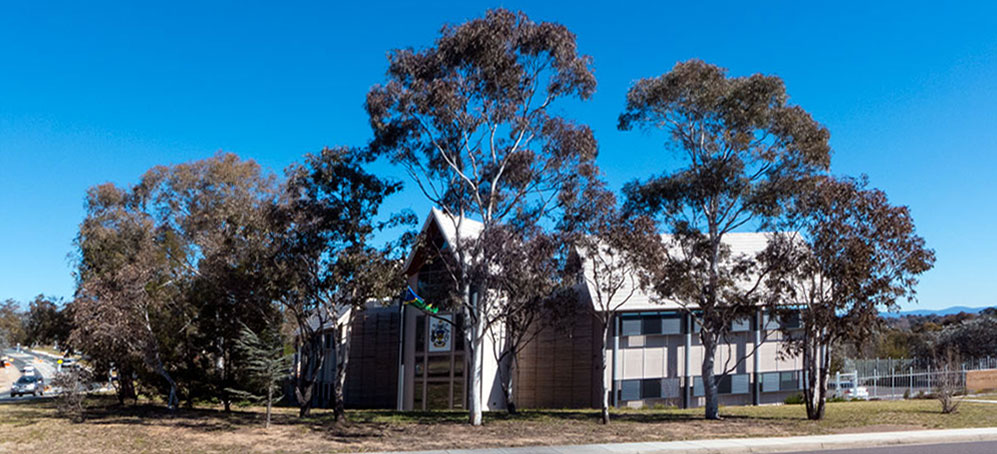 I spotted this example of successful embassy architecture as I was driving past to have lunch at the Beaver Gallery Cafe in Deakin. From the available online information (and there’s not much) I think these new buildings for the High Commission for the Solomon Islands were completed around 2011/2012.
 The architect was Colin Irwin from Nowra on the wonderful NSW South Coast. He has since changed firms and now heads iarchitecture – click here
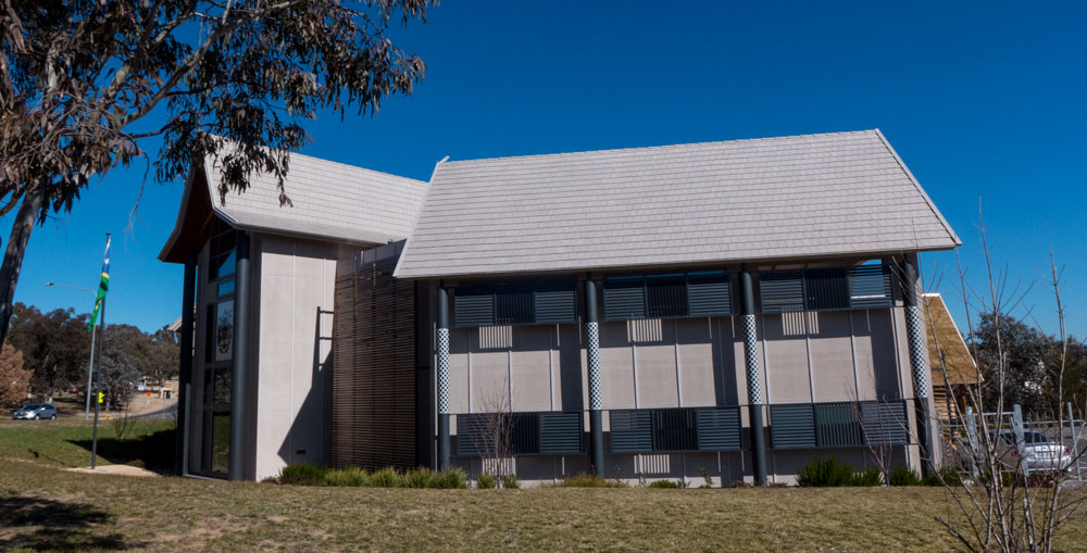
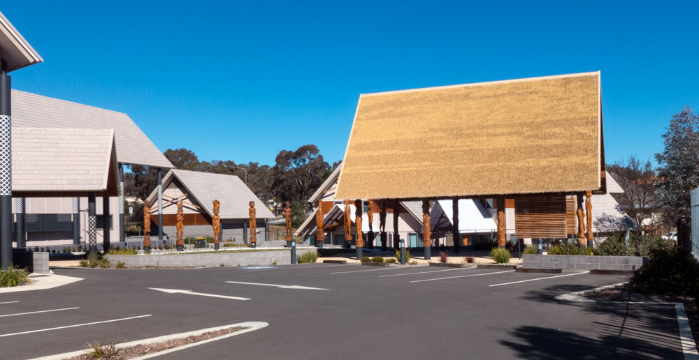
From the roadside I was able to observe that there are numerous buildings forming a precinct and I gleaned more details from the online information. The precinct consists of two residences, a double storey office complex, a series of outside sculptures and a shade pavilion. The sculptural pieces in the courtyard are nine carved timber totems that are four metres high representing the provinces of Solomon Islands.
The image below highlights to presence of the inner courtyard, plus you can see an open verandah on the end of the two storey building. (see also image further down)
I congratulate the architect and embassy for coming up with a simple but very individual style of architecture. The first impressions are very positive and it was enough to make me stop while driving past. There’s a very appropriate use of materials.
Based on the limited online information, the high commission buildings have incorporated several energy efficiency and sustainability features including some geothermal heating. The buildings have been laid out to form a courtyard where traditional ceremonies will be conducted. This courtyard arrangements allow for a village-like atmosphere; but maybe there’s a bit too much bitumen to achieve that fully.
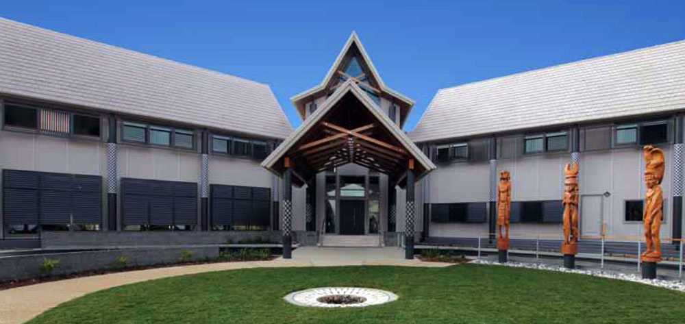
The following images have been ‘borrowed’ from the architect’s own website:
The first image below is the central doorway inside the courtyard whereby the two wings of the buildings are joined through this foyer.
Here’s a night view of the courtyard and totems. The landscape design work is a bit lacking!
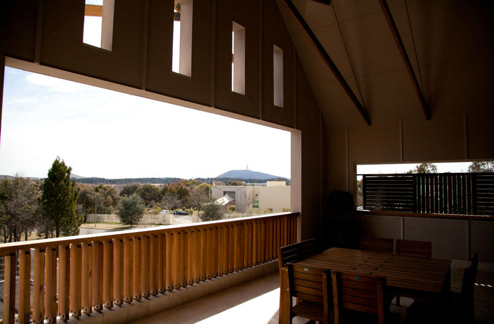
The image below is the inside view from the second storey verandah. I often wonder why we do not see lots more of these in Canberra architecture.
Overall this design is very attractive. The major flaw in the whole presentation to the street is the surrounding landscape. I suspect that the high commission may not control the grassed sidewalk areas out the front and to the side. The gum tress are wonderful (as they are always), but all those patchy grassed bits detract from the very successful architecturally design structures.
Sadly many architects do not appreciate the benefits of collaborating with good landscape architects – and in this case it shows that this was not done.
Surely someone could arrange for a good local landscape architect, such as Harris Hobbs Landscapes, to be given a commission to add some creative landscaped features and native plants to this site. The same applies to the inside courtyard.
We are indeed lucky here in Canberra to have a number of innovatively designed embassy buildings. I hope to feature more over time.
Meanwhile, I recommend you have a walk around the Solomons Island High Commission, on the corner of Beale Crescent and Denison Street in Deakin, Canberra.
————————-
Urbanity Rating: 8/10 (The site needs more effective landscape design work)
——————————————————–
for more on architecture – click here
Paul Costigan, 13 August 2014
