Review: Visual Arts
City of Trees, National Library of Australia, Canberra, 5 July – 7 October 2013
This review originally published August 2013
One lazy Saturday afternoon I took myself over to the National Library of Australia. I had read all the advertising and was very much looking forward to an exhibition on the trees of Canberra.
Any exhibition that focused on the trees of Canberra has to be something to see, something to talk about, and something that would be most embraced.
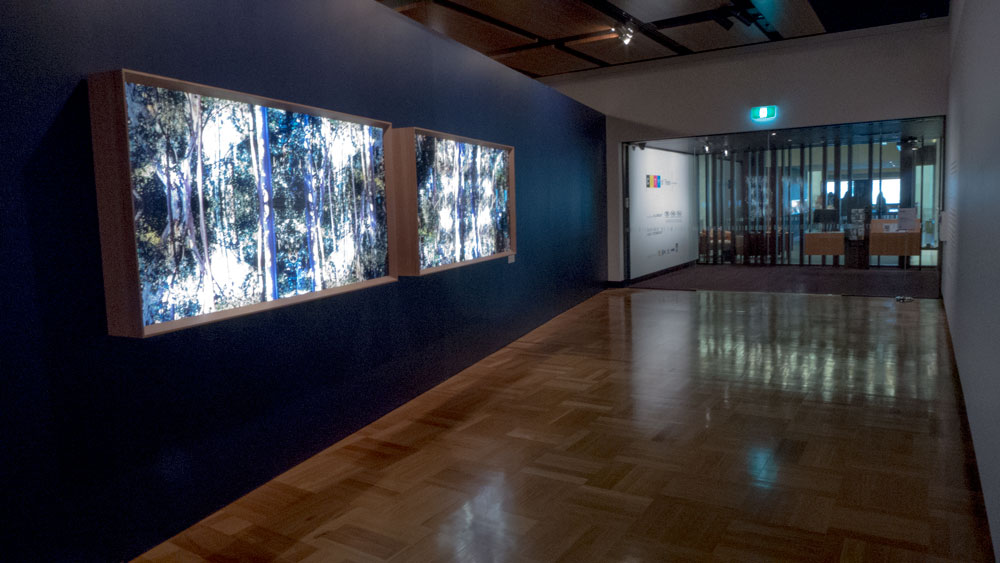
 the entrance with two light boxes
In short, this one did none of those things for this reviewer. This exhibition in this prestigious national library exhibition space just left me wondering just what happened. Did the exhibition curators sign up a feel good Centenary Exhibition about one of the core features of the national capital; its fabulous trees. And then the pieces arrived and there was nothing to do but to make a good show of it. In this case it has been well laid out with all the usual fine aesthetics of good curatorship. But the content is just not there.
I love trees. I love the trees of Canberra.
But this exhibition would do nothing to celebrate what the people of Canberra love about their national capital and its urban forests. The artist is an outsider to Canberra and it shows. This is disappointing. As this city could do with some constructive criticisms even in the year of celebration. Maybe the nature of Canberra, being not the usual city model and its abundance of urban forests was just too much for the artist to get her head around. The works look to be just draft thoughts and do not present coherent new thoughts. You will not leave this display with any new thoughts or pondering on anything except maybe to ask, ‘what was that all about?’
However if you were to first read the fold out pamphlet that goes with exhibition, then you would be led to believe that you were about to see something truly wondrous. The writer, Michael Desmond, has delivered something well worth reading especially given the diversity of audiences that will be picking up the pamphlet, being tourists both international and national along with all the usual local suspects who make their way around local exhibits, and then there are the researchers making their way into the reading rooms. His pamphlet reads with enthusiasm and clarity and portrays Michael’s love of the city’s trees.
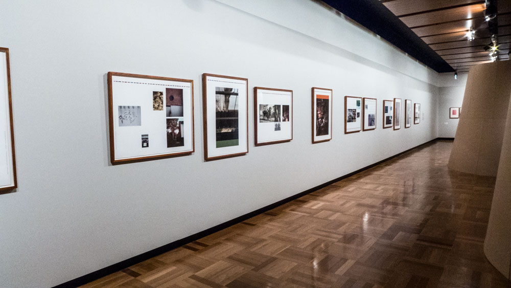
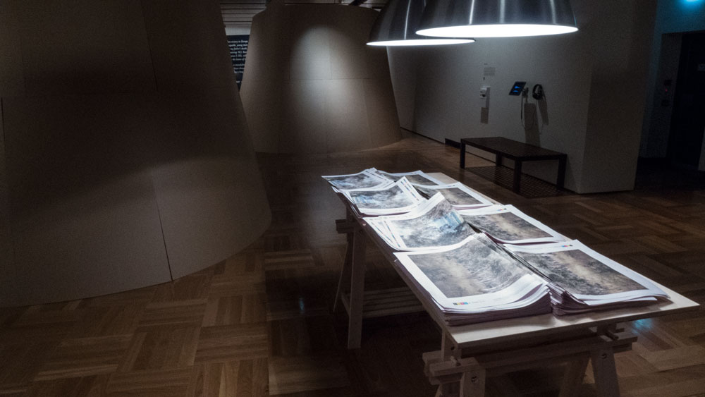
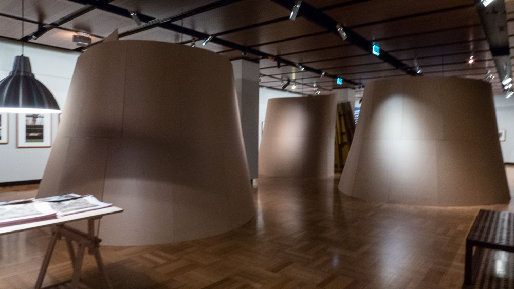
Within the exhibition are a number of elements: two large light boxes at the entrance with not very interesting photographs; a wall of collages about trees which are apparently represent drafts for a book. Yes they are very draft. Dominating the room are some very large sound booths for oral histories. The trouble being that the sound from any of them fills the room so the exhibition can be a cacophony of voices. Hardly the nature of trees. There are some poems hanging from one wall, a layout of newspaper pages and down the other end are interesting graphic works on blotting paper which were in fact the highlight even though they did not have much to do with trees.
my final word: Yes I was very disappointed. Good pamphlet.
Rating 4/10


