Review: Urbanity
A work in progress – reviewing the National Portrait Gallery in Canberra
The National Portrait Gallery of Australia opened in 2009 to much acclaim. This national cultural institution has become a very popular tourist destination. The gallery sits in amongst trees in the National Parliamentary Triangle alongside the National Gallery of Australia and the High Court of Australia.
While I have seen nothing but praise for the building, I beg to differ. Particularly when talking about the outside of the building and how it ‘sits in the landscape’. More on that later.
There is no doubt that the exhibitions of portraiture has been a success. The gallery spaces work well and visitors enjoy the experience. I will make comment later on the other public functions, namely the coffee shop and the bookshop. And while I am at it, I will offer observations on the surrounding landscape works.
So to below are a series of images taken in the month after the Portrait Gallery opened. These are followed by some taken in 2013. I am adding to the latter set as the opportunity arises.
I have also included some links to other reviews and comments.
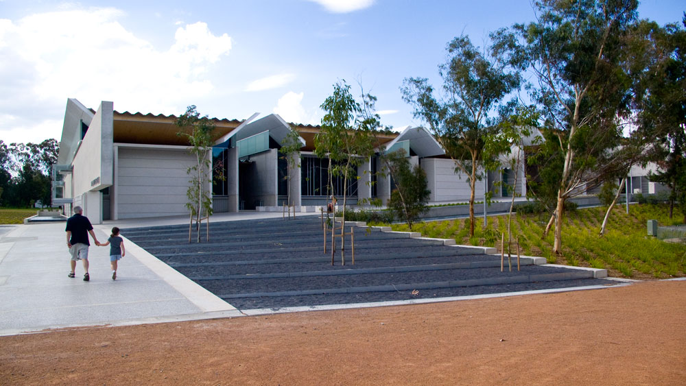
2009: The entrance from the road. It is actually a drop of point only. This approach provides the first view of the plain concrete façades.
 2009: The entrance from the road. It is actually a drop of point only. This approach provides the first view of the plain concrete façades.
related reviews and comments:
A 2009 review of the building by Catherine De Lorenzo
A 2010 review of the gallery by John Thompson
About 2009 the architecture award received for the building
The 2012 review of the building by the Architecture Association of Australia
August 2013 – review of the exhibitions
and – a link to the gallery
There are several ways of approaching the building. Most would most likely come up from underneath from the underground car-park and therefore not see the outside of the building. The other is to approach on foot from the National Gallery of Australia either as above or across the joining bridge (to the right of this picture).
The building is not a large structure when compared to others in the area. This is a good thing. It is a contemporary structure with some hints of being a number of units, or sheds, joined together to form one wider exhibition hall.
In all the times I have visited I have yet to be excited about the outside architecture. I find it a building of limited interest with some interesting bits here and there. The overall feeling has always been that a good opportunity for an interesting or innovative design was missed. This could have been a result of the brief, the conservative nature of those who oversee the Parliamentary Triangle and/or most likely a tight budget.
And as far as being designed to be of the place? No, it has been plonked onto a great site with little integration into the surrounding landscapes.
It is a shame that outside of the first new cultural institution building for the 21st Century on this site is very functionary and not much more. It also seemed to have mostly missed the point when it comes to addressing Climate Change and the host of contemporary sustainability issues. I have read bits about some rain water being caught but besides that there is no much else.
The front area is all concrete and you know this when you cross it during summer. It can be a very uncomfortable place to meet anyone.
Away from the front of the building there has been some attempts at landscape works. Sadly, all quite basic. So if you want to see landscape at work, just head to the National Gallery across the bridge and take in the tree tops as well as the two gardens around both sides of the NGA.
 The above image is the more interesting view along the front from the south. On a cool day.
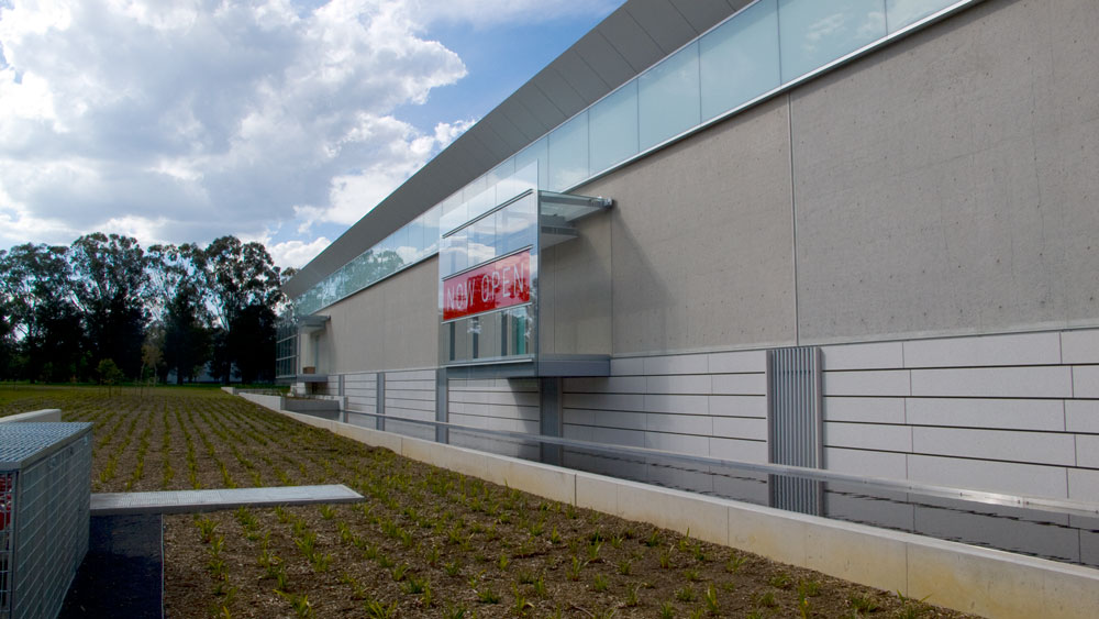 To the left looking along the south wall that faces onto the road.
The landscape work was very minimal at this stage. Shame really given that the building was very much talked about as being part of the landscape.
 A water feature. Did nothing for me in 2009. Obviously design by the architect instead of a serious water design professional. Have yet to check it out again.
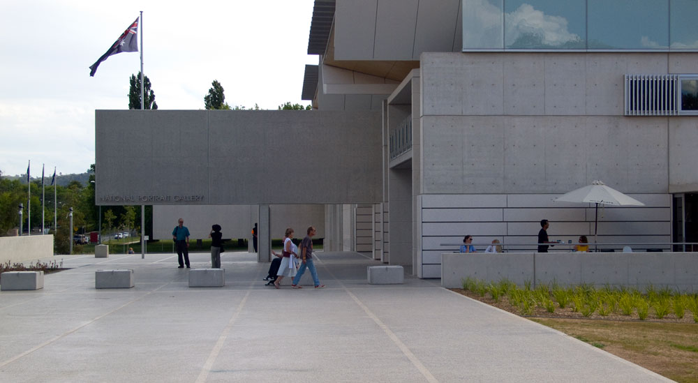 Looking from the other side, being from the north back to the front of the building and the entrance which is under that slab of concrete with the name of the place upon it.
An alternative entrance can be through the coffee shop which is directly to the right where those people are heading and you can see people sitting outside. A good cafe. Just not big enough.
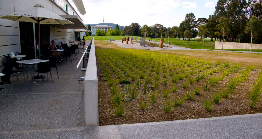 The north side of the building. An entrance to a very good cafe. Just that it is not big enough. And why not make more of that northern aspect and all that wonderful Canberra sun shine even on cooler days.
But I say again. A good cafe. Good place to meet (on a quieter day). As for the attention to landscape? This picture says it all.
Back in the 19th and 20th Century architecture was always was always about the building and thinking about the spaces in between some time later if at all. Looks as though things have not changed that much. So much for the building being part of the landscape. So much for 21st Century architecture that should have been about integrated design and providing a key case study for the Commonwealth on how we should be designing with climate change and sustainability in the forefront of our design solutions.
I would give this building, which includes the surrounding landscapes, a generous five stars out of ten.
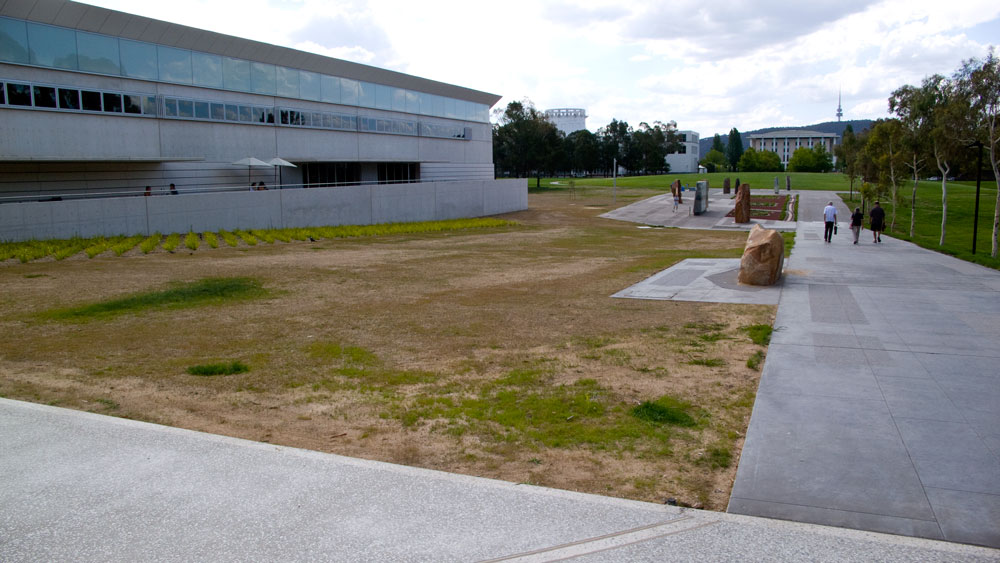 The north side which is how you first see the building if approaching from the National Library (off in the distance) or the National Gallery (behind you).
It is a large shed. No architectural wonder here, so please move on! And the landscape?
 From this angle the building looks like some form of large shed or maybe an apartment building. Nice rocks. But they are part of another work nearby.
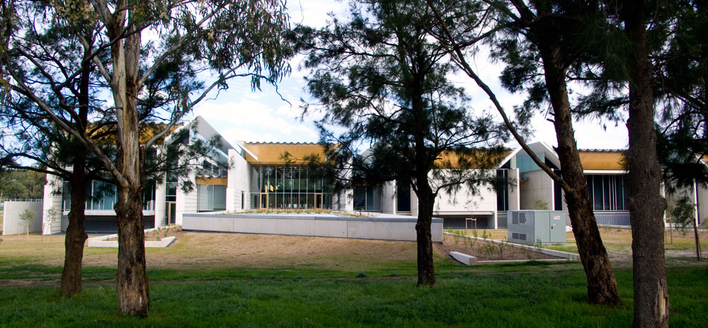 The view from the trees to the west. We will check out the landscape again in a few years time.
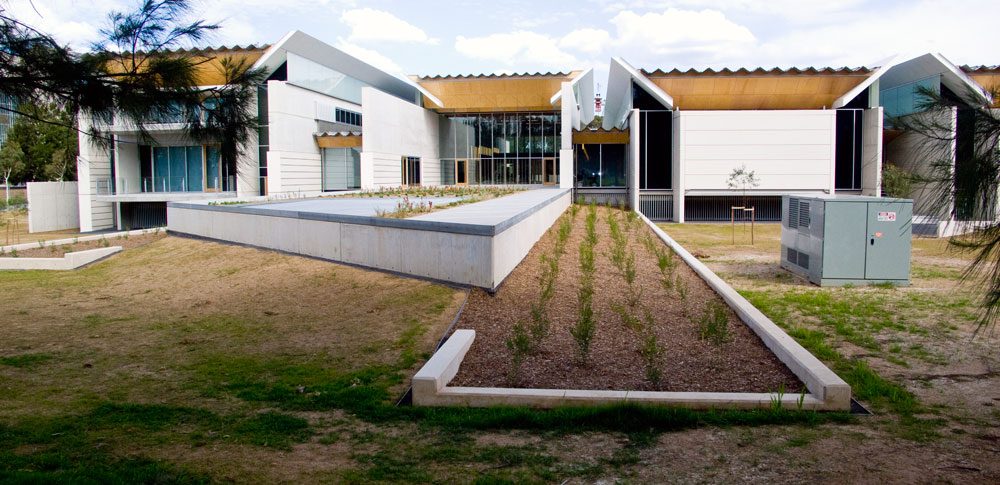 Absolutely of moderate interest. So let’s move on and come back years later to see what has happened with the landscape expenditure and maybe some original ideas. Nice electricity box!
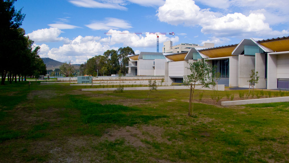 Moving around to the south again.
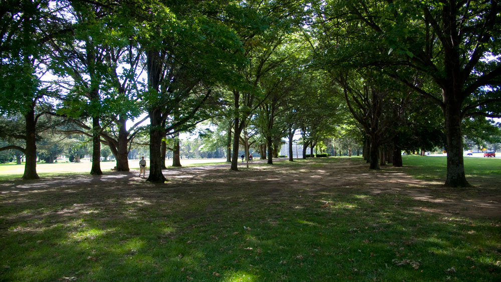 Just love this row of trees. Shade! These were there long before the building.
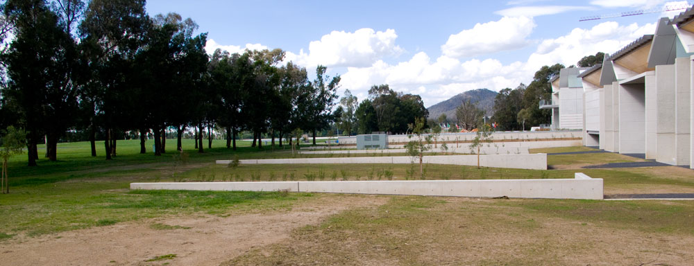 nothing exciting here – move on…..
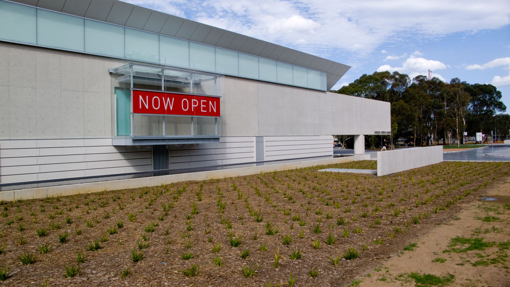 And back to the south side and that wonderfully not so well designed landscape. And all that bland concrete wall.
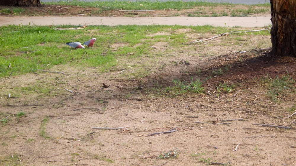 Even checked on the locals to see what they thought. Alas like so many other people these days, No comment.
————————————————
the gallery in 2013
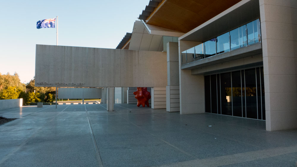 No change here. Interesting sculptural piece stands alone at the front door.
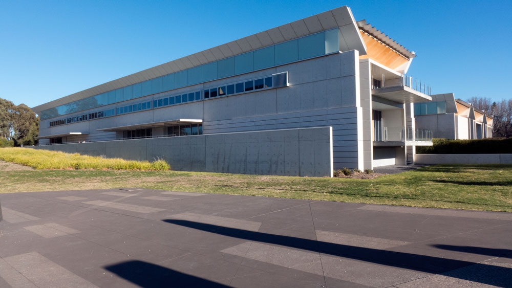 In 2013 that north face of the building is just as uninteresting. Still looks like an ordinary apartment building rather than an innovative cultural institution.
 And yes – they are still nice rocks.
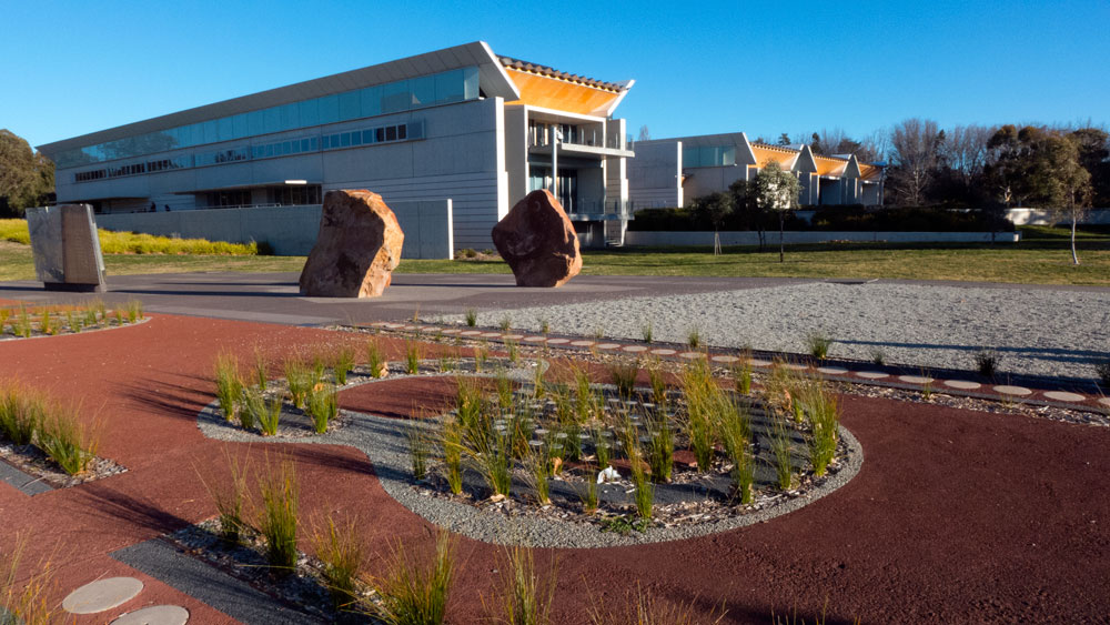 More on this little garden maybe later.
 Maybe these are apartments to rent.
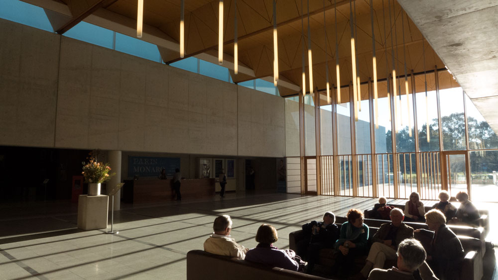 and inside? This where I agree with the reviewers. The foyer and entry areas have a presence and you definitely feel as though you have entered somewhere of note.
That west window is supposed to be the key to the building being part of landscape. Much has been made of how this joins to the Griffith land axis and that it allows the interior of the gallery to link to the outside landscape. Not exactly rocket science. Big window and lots of light in the foyer. But why have it face west into the hot summer sun? Why not more north and use the warm winter sun? Solar?
But as you can see from the photograph above, it works as a place to meet and to gather.
The exhibition halls are very good and the gallery benefits from some very well curated exhibitions.
The book shop is jammed packed. One of the great small bookshops. Definitely well run. Congrats to the manager.
Maybe the cafe could be moved one day to an extension attached to the side and then allow it to operate any hour of the day and not be locked into the gallery hours. Then the bookshop could be expanded into the now cafe spaces and become a bookshop with room to move and maybe even spaces to sit in and read.
——————————————-
my final words:
External Architecture? Nothing of innovative interest here. just move on inside. Landscape work lacking imagination. Too much open hard edge up front that all contributes to heat island effects.
Interior? much better. good spaces.
Exhibitions? Collection exhibitions always fun to visit. Some important historical works, with some of the contemporary being wonderful while some others are just clichéd.
Special exhibitions? sometimes very good. and here’s a link to the gallery: http://www.portrait.gov.au/
Bookshop? great but too small. always worth a look. Not much fun when crowded.
Cafe? go there and meet at a quieter time. It is not bad (not great either) and coffee is not bad. Nice to be able to be outside when it is warm.
———————————–
OUR Ratings:
Urbanity Rating: 5/10 (about the building and landscape)
Visual Arts Rating: 7/10 (general exhibition rating)
————————————-
Paul Costigan, September 2014
