Review: Lady Cilento Children’s Hospital
photographed late June/early July 2014 – due to open later in 2014
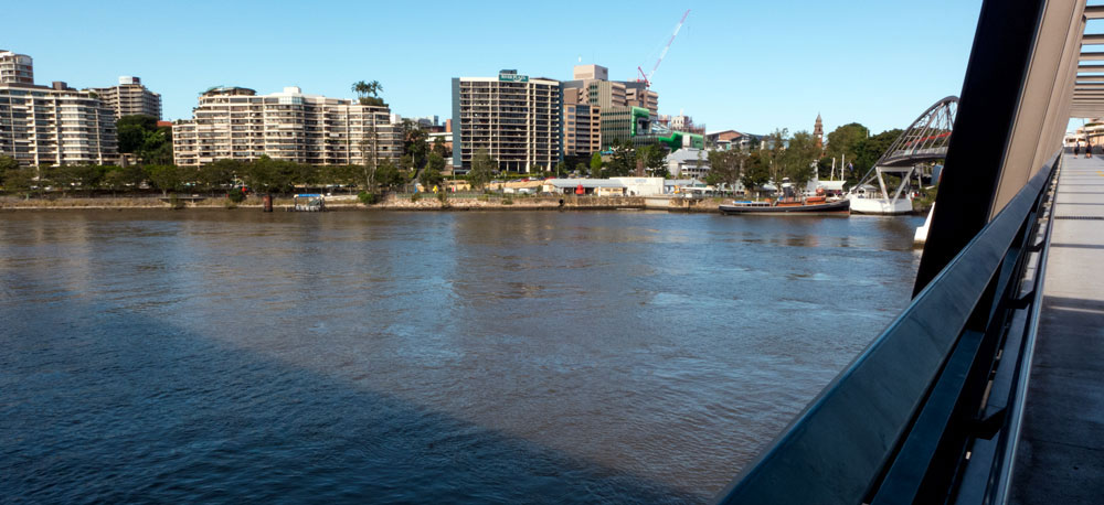
On two recent visits to Brisbane I noticed this new hospital building under construction in South Brisbane. I first noticed it as while crossing the river. I was impressed that at last there was something in the area that was not simply bland-box architecture. (click on photographs to enlarge)
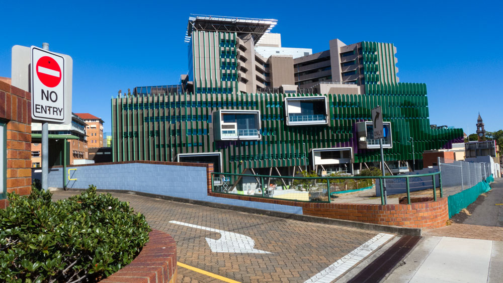
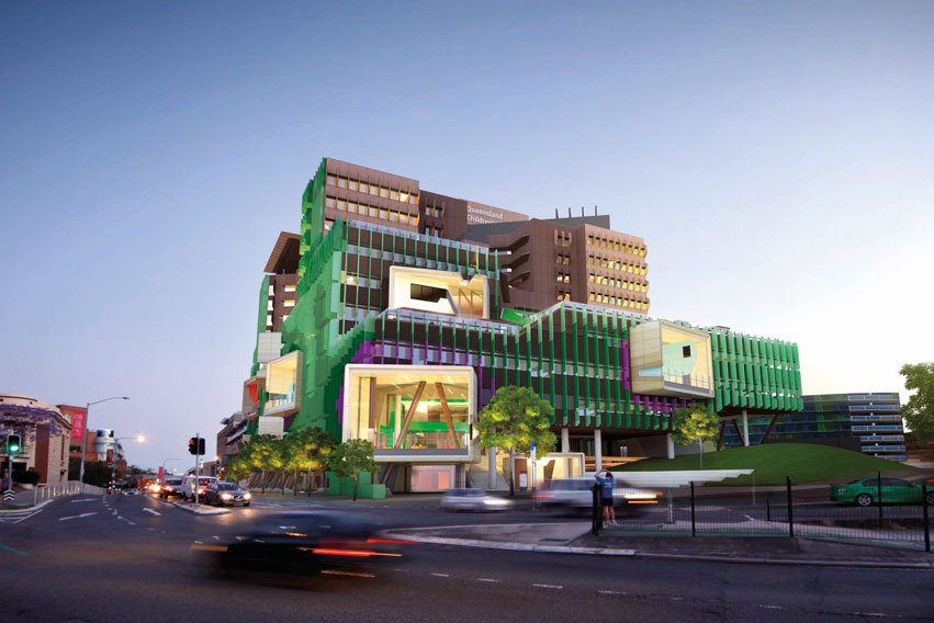
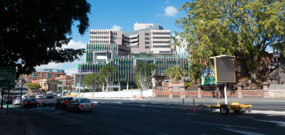
The photograph above will probably annoy the architects as they most likely prefer the front street view. This image was taken while walking down Vulture Street alongside the older part of the hospital. The image below is from their website:
Below are two photographs taken from the river in April. The first illustrates just how bad the surrounding architecture is. The hospital (under construction) is to the right of centre.
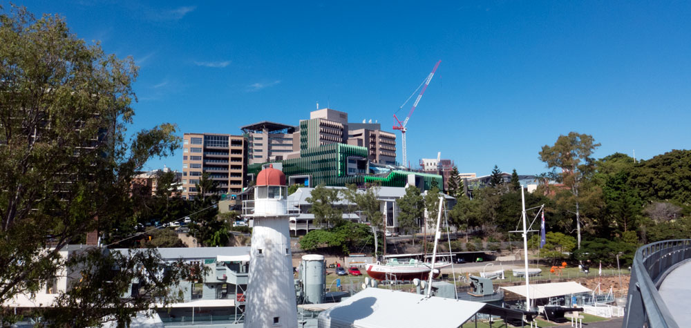
The second is closer, but still from the walking bridge.
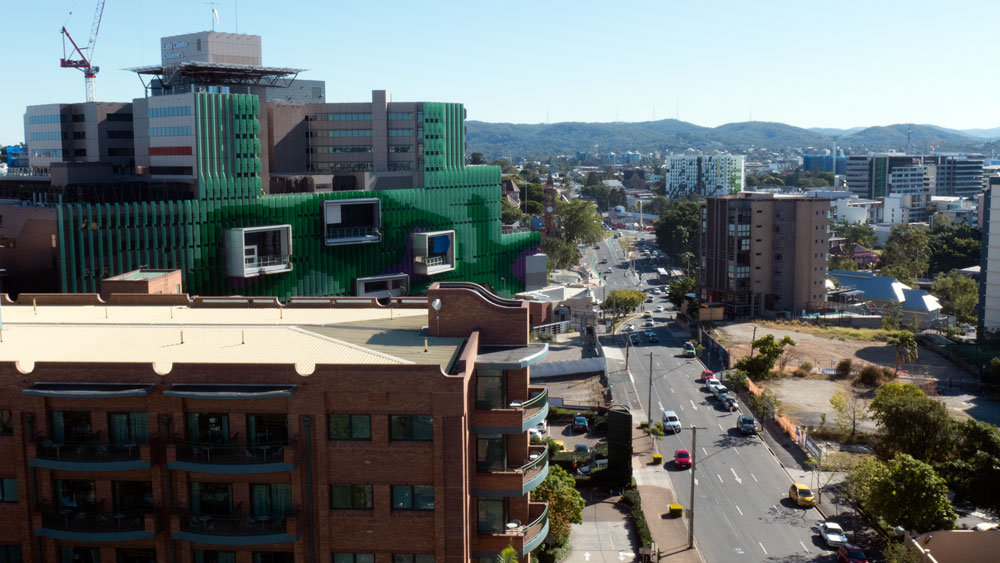
and here’s one taken on the last day of June from back up the hill looking down towards South Bank across the roof of the older brick building. Note the vacant lots across the road where more apartments are soon to appear.
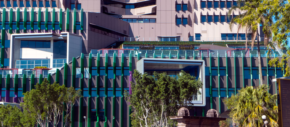
The exterior of the new building will definitely be a landmark in this area especially as it is surrounded by so much boring apartment buildings and from what I can see, there are more blandness on the way. The new hospital building has some interesting features such as the large portals which should provide wonderful views from within.
There’s a lot made of the building using ‘environmentally sustainable design principles to help reduce its carbon footprint’. If this is true, then this could be a good thing. I searched on the government site and found a PDF (click here) – see my comment later. It was good to read about the approaches to recycle of the materials from the demolition on site.
There is also mention of parklands and rooftop gardens.
The photograph above is from top of the South Bank. You can just see the rooftop greenery and a children’s playground.
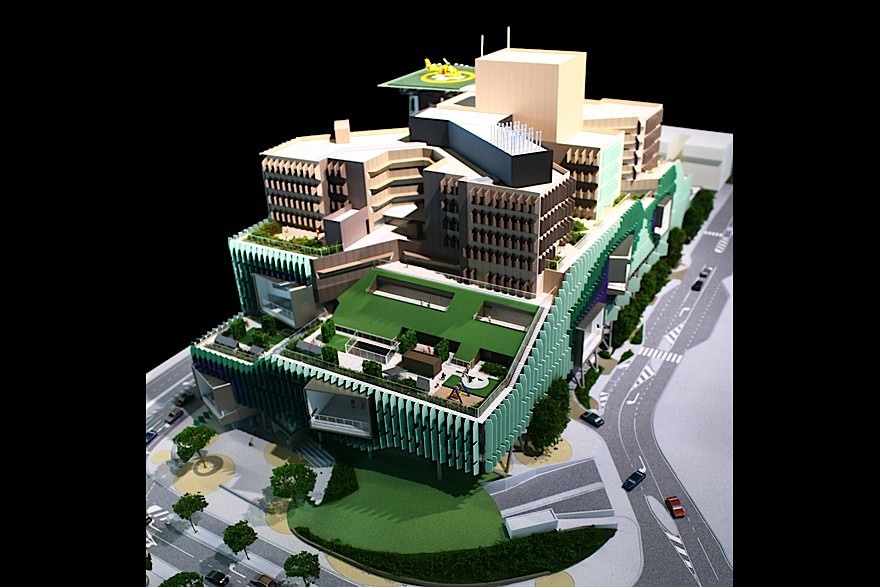
Below is another image from the architect’s website – it shows more clearly what they are talking about.
From the street you can see there are several bits of greenery attached to locations across the rooftop. This is all very good.
I hope we do not see all these green bits exaggerated in later marketing as if it all adds up to something super special and award-winning. It is a children’s hospital after all, and as with any children’s hospital, there should be loads of parklands and courtyards.
These rooftop gardens and other things are the least one would have expected, especially given that not much other provision for outdoor spaces have been incorporated by the architects in their design of this children’s hospital.
The front park is a nice token so let’s just be grateful there is at least this little bit of natural parkland.
The exterior is really a beige set of blocks made out of fairly ordinary materials with addition of loads of pretty green facades thingys and those quite special portal windows. The exterior catches the attention. But architecturally it is fairly simple and I suggest that this is probably a good thing as maybe the resources and attention has been concentrated on the interior architecture and fit-out.
Another note was that this building comes with its own helicopter landing pad on top. There’s another platform just two buildings away, so that makes this a two helicopter hospital. While we were staying (next door), there were regular comings and goings of ambulance helicopters. One resident told me that on a recent very windy day the crew came out with a bed on a stretcher, but the wind was so strong that the mattress simply took off and blew over the side of the building.
Overall I have to say that the green battens (or whatever they are) on exterior architecture of this beige building provides quite a profile in South Brisbane where there is no much else of note architecturally. Apparently they are heralded as installed to reduced the glare of the sun. I supect that may also obscure the views.
I am sure we will see mention of the external architecture in awards and marketing spin. But not from me – it is OK but by world standards it is nothing special.
Optimistically the attention will be more on the interior where it should deliver the right ambience. Let’s hope so!
As for the rooftop gardens and other green bits and pieces, yes they are good and what we would have expected. But for a complex this size, I do wonder whether they are enough.
And finally, given that it is 2014 and we all need such large buildings to very seriously address climate change issues, I have located this pdf (click here) about how the architects used ‘environmentally sustainable design principles to help reduce its carbon footprint’. The architects and client should be credited for implementing these now basic standards. But with all that rooftop, there is no solar or anything equivalent? Other than that they remain very carbon dependent – which given the government in power, this would be expected.
Here’s few links; these may change as the building opens (let me know if any links are broken)
From architects: click here
From the Government: click here
From wikipedia: click here
In summary, Lady Cilento Children’s Hospital is an interesting architecturally addition to this area of South Brisbane that is being dominated by an ever increasing number of bland-box buildings.
———————————————
Urbanity Rating: 7/10 (may be higher when we hear about the interior)
—————————————–
for more on architecture – click here
Paul Costigan, 19 July 2014
