Comment: From James Howard Kunstler
 James Howard Kunstler’s blog often has interesting points to offer in the debate about design and architecture and how it is assisting, or not, with solutions for the future.
Click on the image for eyesore of the month of June 2014. I do not always agree with what he sees as eyesores. But it a great start to any debate. In this case, yes, the tall towers’ days have gone but the developers and architects will stay with them while there is money to be made. Stuff the environment!
Click on the image.
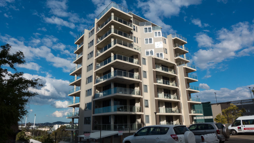
and we are lucky enough to have a new ones here in Australia. This one has just recently opened. While the outside is not much, the interior design looks good. So now we await to see how occupants judge it.
From the outside it definitely matches well with the criticisms as set out by James Howard Kunstler.
I saw it while it was being built and thought then that it was looking like any other tower with a decorative facade and not much more. Time will tell. Click here.
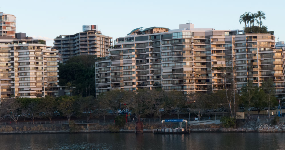
I had previously posted about the not so attractive nature of Brisbane’s CBD. Several months later I have spent time again in Brisbane, and have not changed my views that this city’s centre has been ruined aesthetically by a host of ordinary architecture which comes down to the decisions by the local government to allow architects and developers to carry on doing what they do best. That is architects and developers are making loads of money plonking towers on the CBD with no thought to the overall aesthetic of the place and to the environment.
So I suggest that the whole Brisbane CBD qualifies as an eyesore.
Click here for the previous series. Click on image below to enlarge.
I have been asking colleagues for an architectural term to describe the eyesore cut-and-paste design (or lack of it) being used for most apartments and commercial buildings. One colleague said that it was down to the lazy use of CAD by architects.
I think for now I will settle on calling this boxed eyesore style of apartment production by the simple title of Bland-Box-Architecture. Unfortunately that title probably covers most of the output of most architectural firms in this country.
——————————-
for more on architecture – click here
Paul Costigan 30 June 2014


