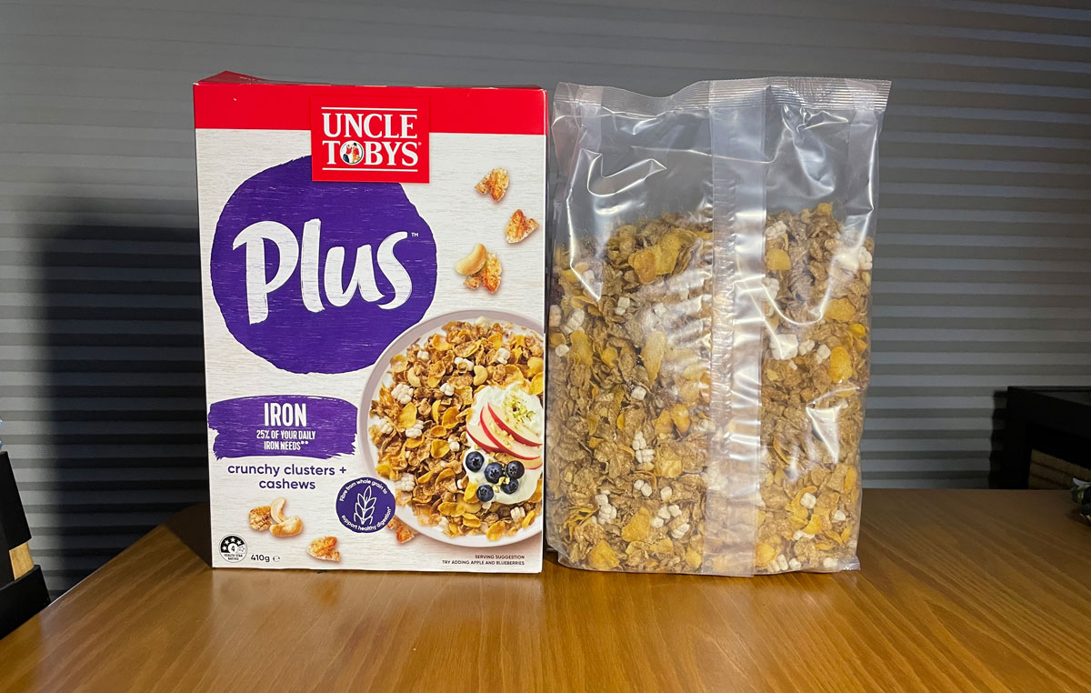
When you buy cereal, the packaging, like it or not, plays a part in your choices.
With the above, I had also read the food contents on the side to check sugars, salts etc.
When opened it was noted just how much the space was between the real top of the cereal in the inner package and the top of the box. Why so much space?
BUT
as it happens I like to mix cereals and so buy another brand with low sugar content and mix them together in another container. This latter one was also recommended by Choice magazine.
But then there is the problems of that space between the top of the cereal and the actual top of the package. Choice failed to mention this.
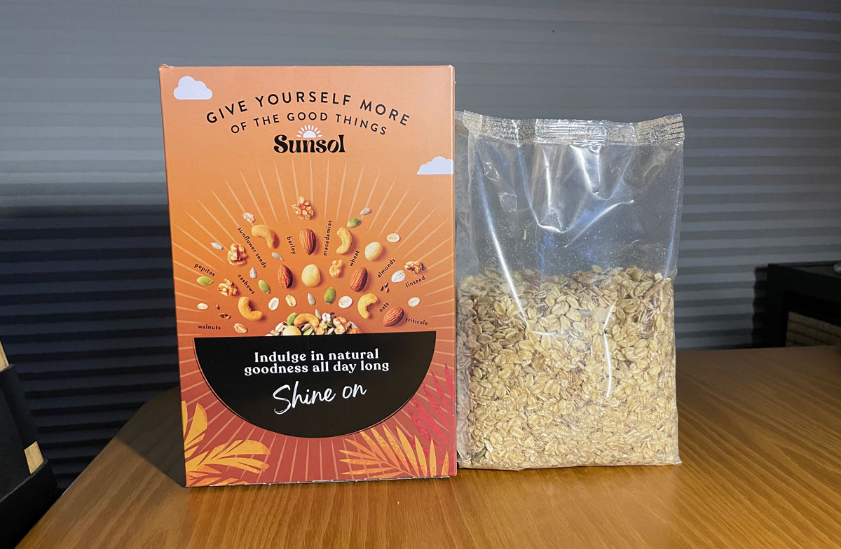
What is the game here?
Obviously something to do with buyer perception.
It was not about price – as I had checked it out not only for contents (sugars etc) but also read that small print on the shelving that indicated that per 100gm this cereal was a good buy.
What a waste of packaging – for what reason?