Review: Urban Development
Sydney’s Central Park development, Chippendale, Sydney
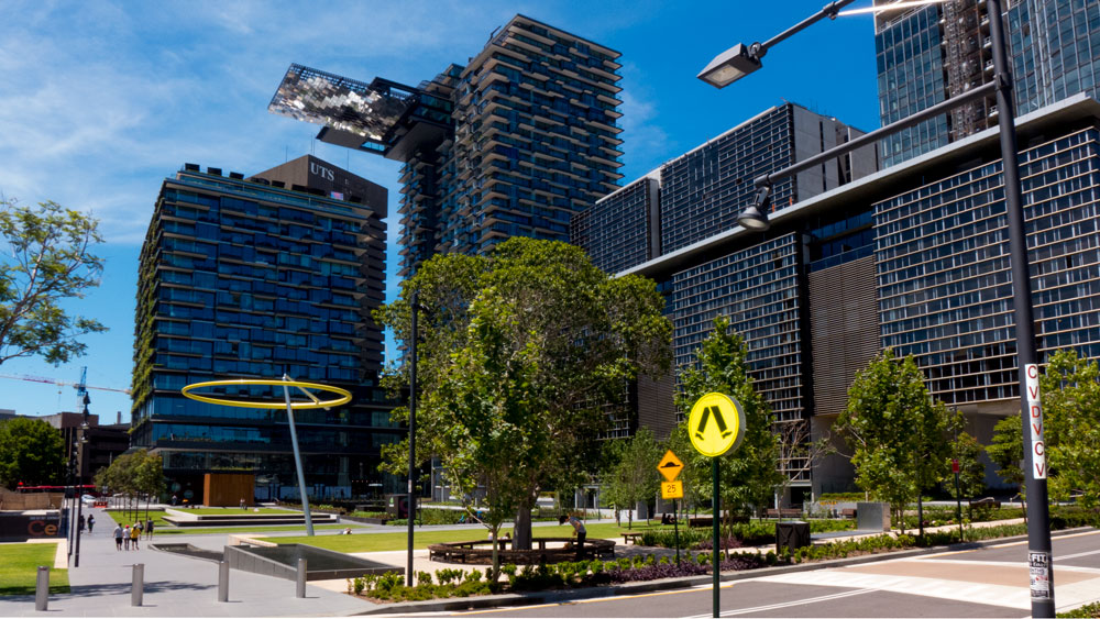 photographs by Paul Costigan – click on image for larger
The Central Park development of the old brewery site opposite UTS in Sydney, has attracted much attention in the last couple of years. Most of this was in the form of churnalism, being column space based on using the developer’s media releases. There has also been the expected paragraphs of praise by ‘industry’ experts in profession’s trade magazines.
As a summary, after a visit to the site in early December 2013, I was very much underwhelmed by the total development. My expectations had been raised through the multitude of promotions. I anticipated a new style of development and one that was to be composed of so many elements designed for the future of 21st Century. This whole development does not present the revolution in urban development we are all waiting to arrive. We will just have to wait a little longer. again!
Central Park, Sydney, is a staging of where we have been with competent architectural and landscape design concepts in Sydney. The Central Park development is not a sign of things to come but a polite nod to where we have been.
In architectural terms, Australia has far better examples. In park design, there are so many more responsive design solutions to be seen elsewhere. As for the integration of art and public art, there is little and what there is does not sit well in these spaces.
Maybe the developers or the City of Sydney have plans for much more art works to come, but for the moment the art on this site is not numerous nor is it exciting.
As for addressing climate change adaptation in a comprehensive integrated way, there have been some efforts but as an overall comment, I suggest there may be a six star case of green wash.
————————————————–
————————————————–
The whole development has an air of importance as many well-known architectural names are mentioned in the promotions. The development has received endorsements from many heavy hitters, including UTS itself, and the usual lot at the Green Building Property groups. I can imagine the local architectural and urban writers hesitating to offer realistic critical analysis especially those with contributions to the professional trade magazines.
One questionable statement by the developers was that ‘At the core of the One Central Park plan is Vision 202020, a national program to increase green urban space by 20 per cent by 2020.‘ Given that the program was launched in late 2013, one wonders how such a new program was core to the development that commenced work at least eight years ago.
than there was this: “The public park at the heart of the precinct climbs the side of the floor-to-ceiling glass towers to form a lush canopy. Using 250 species of Australian flowers and plants, the buds and blooms of the vegetation form a musical composition on the facade”.
I am still pondering about the large boring green lawns and how they climb and link up with the patchy greenery on the side of the building to form a lush canopy.
And some of the plants are in trouble already.
Go back a few years, and it is still possible to find the voices of concern and opposition, mainly from nearby Chippendale who were making sure this huge development was not going to impinge on the cultural nature and the ambience of their neighbourhood. These same voices are active today as the developers have applied for another variation to their plans to change the purpose of a building that is much closer to the existing streets of Chippendale.
There is no doubt that some of the engineering environmental solutions being built into the building sound as though they will assist in climate change adaptation. Here’s a piece from the financial review. I have to admit there is too much spin in the statements being made towards the beginning of the article whereby the developer makes claim to such things as the new park being one of Australia’s finest green space projects. This and a few of the other spin doctoring about green infrastructure served as a warning shot that maybe all the other claims are not as true as presented. My Green Wash warning alarms were ringing.
However there are elements that are steps in the right direction if benefits are forthcoming long-term from such infrastructure as its on-site water recycling plant, tri-generation power station and central thermal plant.
A big plus for the development will be if the claims for the re-use of rainwater actually deliver. There’s apparently also green roof tops and solar power. Again, if true and if they function, this will be a good thing. But I have to say that by now, being 2013, should this have become mandatory and therefore should be expected in all such developments.
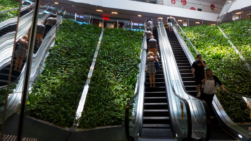
As for all the claims relating to the hanging gardens, I have to say that I find these just a bit too exaggerated. Having taken the time to walk around these new buildings, I found the buildings to be fairly plain glass boxes prettied up with some additions to break up the lines and a generous use of greenery to achieve aesthetic enhancements. And there was the one high-profile and much promoted green wall.
I have seen many large developments elsewhere whereby the buildings have open spaces for upper level parks and with far more aggressive use of shrubs to provide real green infrastructure. Time will tell whether this hanging greenery remains and whether there are any benefits to be gained. Or will it be superficial and simply make for good promotional photographs. There goes that green wash alarm bell again!
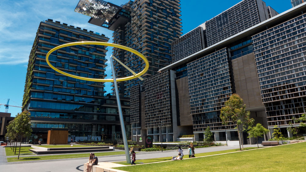
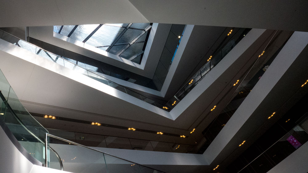
Another big part of the media splash for this development has been the use of artwork. One is that light thingy that hangs above the main development. It increases the ‘natural’ light into the mall underneath and on particular nights, it lights up.
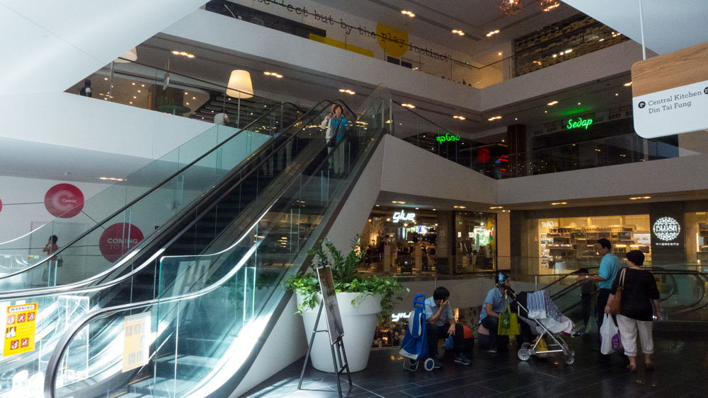
To state the obvious. They have built a medium size mall in a city that is famous for its sunshine. The medium size mall is nothing special when compared to contemporary malls. The shops are mainly within the building and have to be completely air-conditioned.
What does it take to design a medium size mall that is open to Sydney’s light, fresh air and its cool breezes? If this was done, then such an engineering monster sitting above the building would not be required. In short it is not art. It is a waste of space given that it is being used to provide light in a city bathed in light and most of the time has very appealing weather and comfortable temperatures.
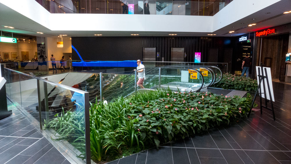
The mall has lots of plants around the escalators. This is definitely a boost to the aesthetics of what would otherwise be a very boring mall. A few tricky angular balconies and plants do not make for anything new.
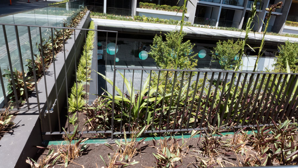
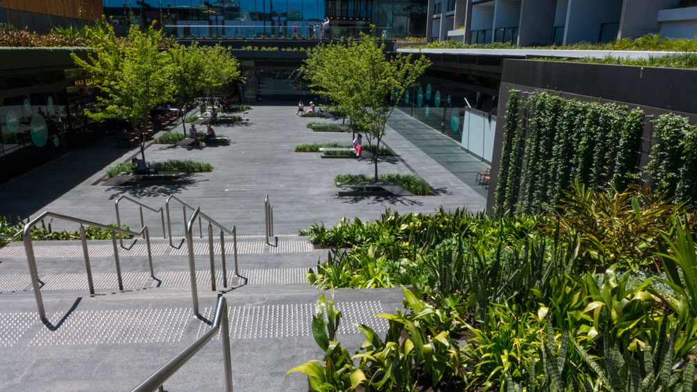
and then there is the very ordinary plaza on the lower ground level outside. Yep. It is functional but very ordinary. A few trees, minimal seats, very little shade, and oh yes, another small green wall.
I have seen a listing once that there is to be floor space for community cultural (arts?) organisations on an upper level. Let’s hope that whoever is invited to use this space can afford the rents. I have seen such initiative before but usually they end up fading away after a year or two due to costs. How long before these nominated arts spaces become normal retail and commercial spaces?
Architecturally I have a conclude that this is a very ordinary set of building with some pretty superficial enhancements. No doubt it will win some awards. How it operates inside from a residents point of view I have yet to glean.
As for looking for food from this mall, I would recommend strongly a walk back into Chippendale and hunt down one of the wonderful cafes that serve the locals. It is just a few minutes walk and well worth it.
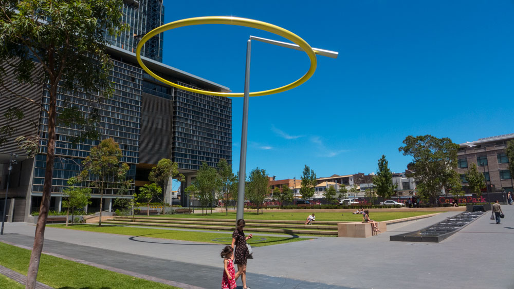
Outside in the middle of the park is the main piece of artwork, Halo.
This is a highly conceived conceptual moving piece. There been a lot written about this $1.3 million commissioned public art work. Yes, note that price!
According to some of the wall signage presently attached to temporary awnings on the side of the park, this artwork is site specific and has been designed with the history of this site in mind. In their words:
The inspiration for Halo came from the history and industrial forms of the old brewery combined with a dynamic response to the natural and built environment of the new precinct. The beautiful circular supports for the enormous old brewing vats inspired Halo’s circular form. A desire to reference the tipsy effects of beer resulted in the ring’s precarious balance and off-centred tipping and turning.
I have to say that I walked around and viewed this piece from several locations and observed people passing it. It is indeed a very clever engineering concept. It does very little for me as an artwork.
Despite the many words from the artists, it does not integrate with the site. It looks isolated. It is as if it has been plonked there to add a centre point to an otherwise very ordinary large open space. I suggest it may be better suited to a more contained site elsewhere.
I could also not stop myself from thinking, what could 1.3 million have bought in the way of artworks? There could have been several engaging site specific commissions.
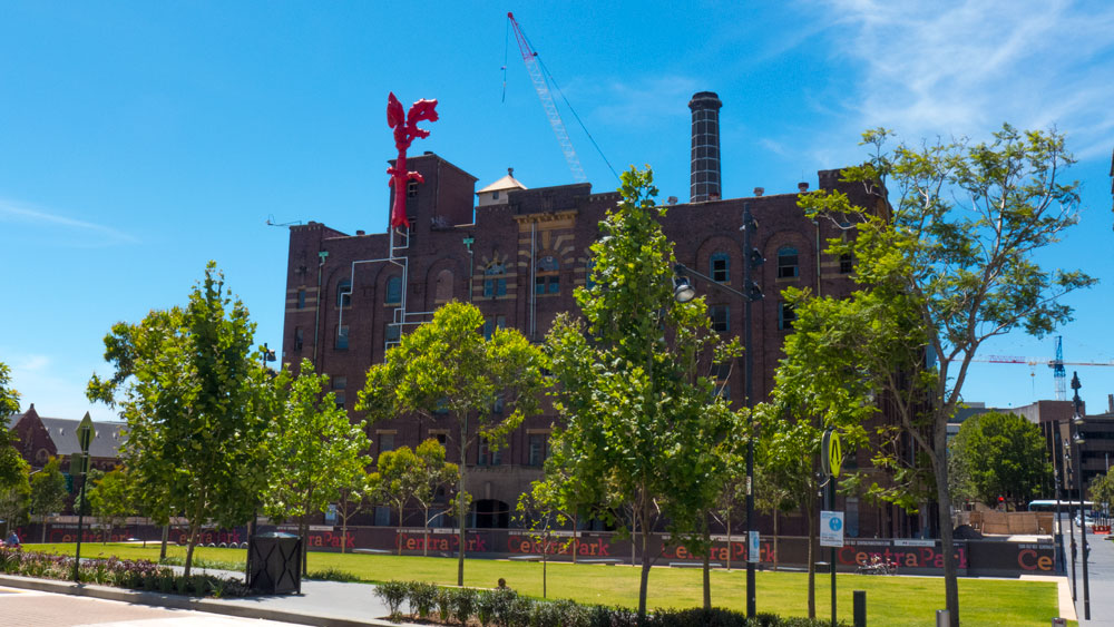 There was an object floating attached to the nearby old building. I have since seen in the promotions that it was an artwork. It was too high to work out just what it was. As such I think it was not a successful piece.
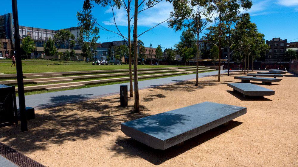 To one side there is some of granite seating for sitting in the sun. Why are these types of slabs always ‘artistically’ arranged.
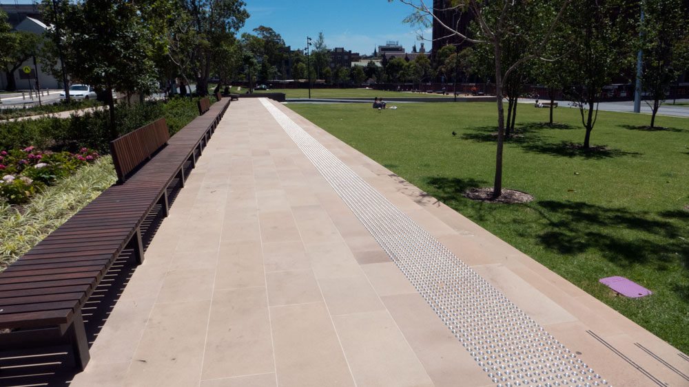 I suspect on a busy day, this long seat would be very much appreciated. The rest is very plain. So maybe that is why no-one was sitting there on this Saturday.
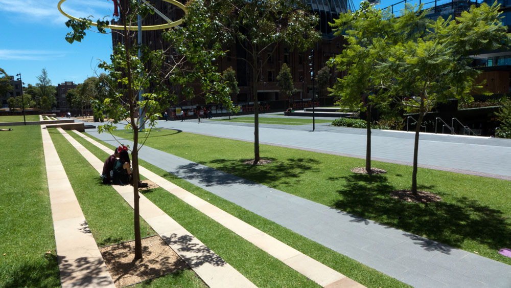 The long steps on the lawn are a good idea for casual seating.
The whole development is called Central Park. To most when I mention this title, they get confused because for most Central Park is that huge parkland in central New York. The park in NY has an aura about it. This development does not have that aura. It is a very ordinary large space. It is a misuse of the title.
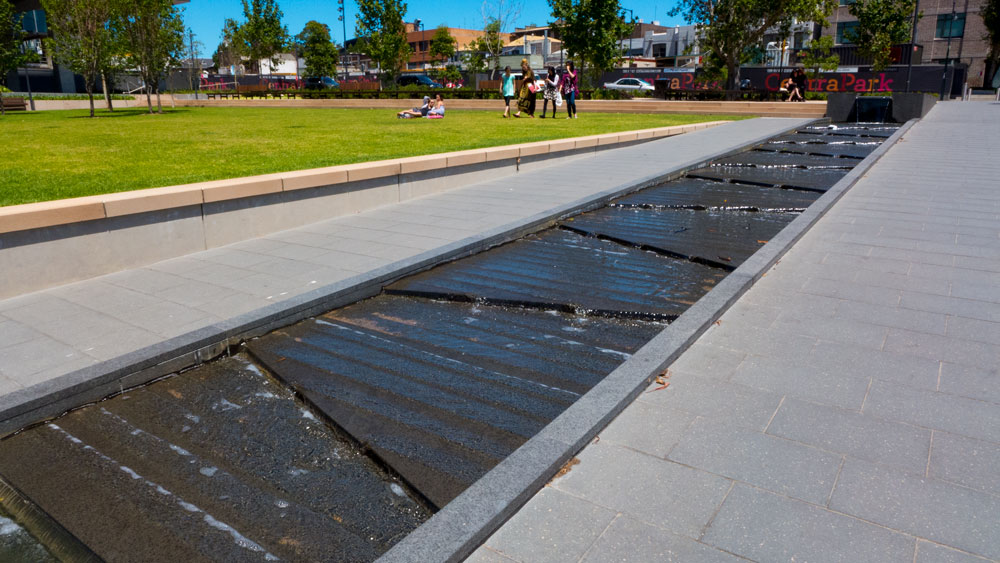
It is a very good thing to have such a large open space on this inner city site. Full marks I suspect to the City of Sydney for insisting on there being such a space for public use.
The whole development is yet to be completed. The old building to the west is presently going through redevelopment and fit out.
There is a planning proposal under consideration for a change of purpose for the building proposed to the south. This has led to some feedback from Chippendale residents who can see the developer trying to access low housing funds to have this building changed from commercial and residential to student accommodation, mainly for oversees students. Click here for more on this issue.
I also noted from reading lots of online pages, that the developer was constantly letting everyone know that this site would be achieving the highest possible green star ratings, with five or six forecasted. I am not alone in saying that I do not think much of the Green Building Council’s superficial green (wash) star ratings. This development achieved a three star rating. I suspect many sites could achieve that level of rating. Not sure what the story is there.
As I stated at the beginning, this development is not brilliant. It is definitely not matching the spin being put out. It is a case of green wash. The park is great for the area but does not deliver anything special, beyond lots of space to play in the sun.
I predict that with the level of big names involved and the high level of promotions, that the awards will be arriving any day now.
Urbanity Rating: 4/10
Green Wash Award: 8/10 (which means it does a good job of faking being sustainable)
————————————————–
————————————————–
Further reading on Green Wash in all corners of our society – read Green Wash, Big Brands and Carbon Schemes, by Guy Pearse.
I will be doing a review of this book soon.
———————————————–
Paul Costigan, 31 December 2013

Well, three years down the track and there is a big problem. We can no longer enjoy peace and quiet in our gardens or in our homes. Over the last few weeks Central Park has become a large noise emitting power plant. An oppressively loud, industrial groaning noise is emitted from the cooling towers of it’s air con / power plant, this noise is 24/7! The noise seems to echo off the taller buildings of Chippendale and of course, it seems louder at night.
How could Council have allowed this to occur, how could this be happening when Central Park is supposedly so ‘green?’ City of Sydney Council has to get this design flaw fixed and ensure compliance with the local noise regulations.