I recently took the opportunity to observe the new shareway along Bunda Street.
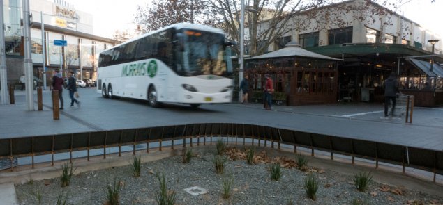
When I first arrived I watched a large bus make its way at speed along the street. Not surprisingly, pedestrians did not insist on their right of way over the oncoming hulk of metal.
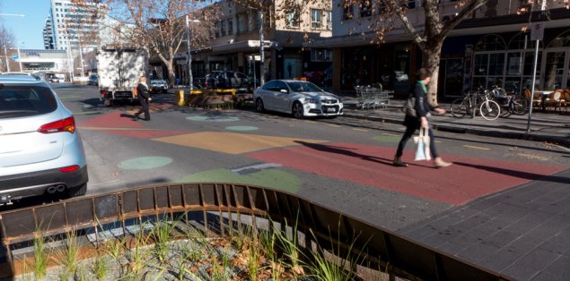
I also saw several cars and small trucks that didn’t realise (or care?) that they did not have right of way. Many were driving at over 20km per hour. Consequently, pedestrians had to step back to allow them to pass. Pedestrians also did well to notice a cyclist’s rapid advance and allow him to pass.

It was up to the pedestrians to insist on their right of way or to choose the safer option of waiting for a space in the traffic. However, pedestrians seemed more comfortable to venture out and assert their right of way in areas where the the road had a raised surface.
Shareways work best when the street infrastructure is kept simple. Unfortunately, allowing for parked cars along Bunda Street (as opposed to only having a few loading zones) has cluttered up the kerbsides too much.
In addition, I am sure the architectural designers liked Bunda Street’s over-the top iron clad garden features, but all they seem to achieve is to add to the visual clutter.
As for all that distracting painted road decoration, the less said the better—except to say that it also adds to the distractions. This is a concern when being observant and watchful of others is so important.
There are more successful, less intrusive and more appropriate approaches to adding plants and the necessary infrastructure along shareways. As with any good design solution, the best advice is to keep it simple!
Before I venture too far in offering more negative comments about this shareway, let me say that they are a welcome alternative to the usual dominance of the automobiles on our urban streets.
Given that such initiatives are uncommon in Australia, it is even more important to get the basics of the design right. Unfortunately Bunda Street is only marginally successful due to the use of confusing design features. We can do a lot better!
Likewise in Dickson, 40km per hour zones have been introduced in most of the streets within the shopping precinct. This is a good thing and well overdue. But the new signage and traffic slowing devices are minimal and suggest that those who implemented the change did not really believe in the slowing down of cars. As a result, traffic speeds have not changed that much.

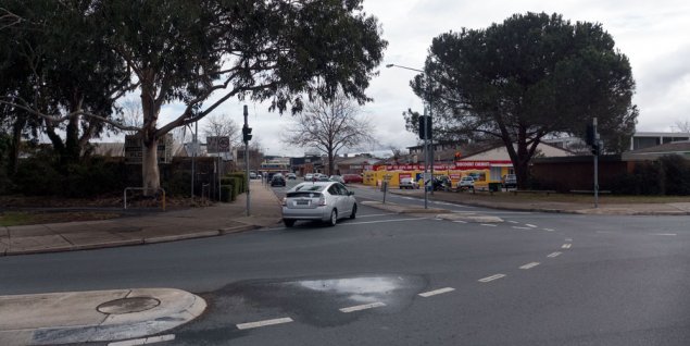
The worst example of ineffective signage is just off Cowper Street where the sign is positioned far to the left, almost into the nearby trees. I doubt many drivers have seen it. But then again, maybe the sign was meant to slow down pedestrians on the footpath!
No matter how many signs and other traffic controlling techniques are applied to our streets, getting people to understand shareways remains a challenge in Australia.
We live in a culture whereby automobiles reign supreme. All other forms of travel, especially walking, can be very dangerous activities when you need to share public spaces with cars. It is not uncommon to see pedestrians caught half way across a street being challenged by a vehicle that appears suddenly around the corner or from elsewhere that then demands the road at all costs.
There are protocols on most occasions, but not all, for how we pass each other as pedestrians. But once one of us in a car, watch out— they are coming through no matter what!
I hope that our government’s roads people assess these initiates very soon and work out what should be improved. The design for shareways requires designers who understanding simplicity and that extraneous clutter and decorations are not part of the solution.
I encourage the introduction of more shareways across Canberra but it must be done using more effective designs.
originally posted to RiotACT
—————————————-
Paul Costigan