
Review The Goods Line Sydney
This is a review of The Goods Line, a linear pedestrian passage besides the University of Technology in Ultimo Sydney.
As can happen with such projects there has been a high level of marketing and spin associated with this development to the extent that it is difficult to separate fact from fiction.
This style of project promotion has become a common practice adopted by many involved with these projects and is a condescending attitude towards the general public. This has worked against most architectural professionals in that people now regard this style of promotions and marketing with great skepticism. People are more likely to comment – “well they would say that wouldn’t they – after all they need to promote this as an enormous success to get attention and get those next big jobs.”
The Goods Line in Ultimo Sydney is one of those projects. There is a lot of spin and loads of associations with other issues, heritage and other projects, in order to create the impression of that the project is important and significant.
It isn’t.
Away from those with an interest in the project, this is a project more or less competently delivered, if you ignore some serious faults, with relevance to pedestrians using the passage.
The delivery is of a contemporary standard for an archi-park. There is no innovation here. This is an example of where this style of landscape design has been rather than where it is going.
As for the marketing, the rhetoric in the first line on an official web page hints at the passage being a ‘green public space‘. This description is given despite their own image above those words that clearly illustrates the obvious, that the space is mostly hard concrete surfaces with a little green here and there. click here
here’s a quick tour:
I started with crossing the bridge alongside the new Frank Gehry building.
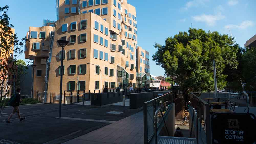
The spaces along here are fairly ordinary. They work quite well in allowing for the movement of people even although pedestrians are forced to weave as the designers have resisted providing a straight line of passage as would be preferred by any pedestrian or cyclist.
So alas, people are forced to walk and have to remain alert to where they are walking, as a wrong step could see you plummet off the edges.
There are a few archi-park features, the table tennis thing and the steel chairs – which look very uncomfortable. Any real game of table tennis would have the ball rocketing into the passing pedestrians. Now surely the designers would have seen that!
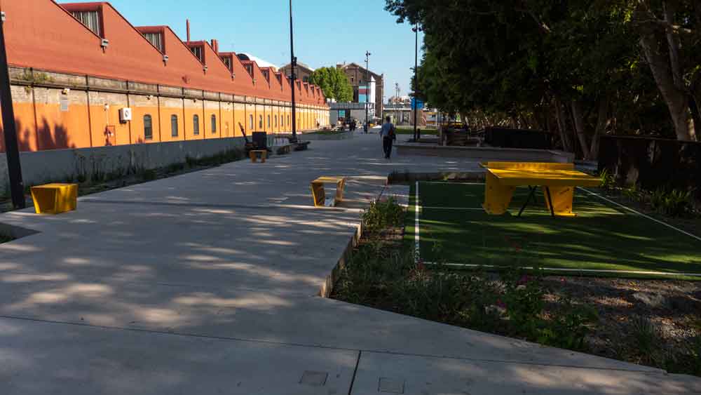
The client obviously did not want too much in the way of greenery or plants. And that’s what they got. Not much except for a few tokens.

and then there was this green lawn space (below). This looks ok until, as one mother pointed out, the entrance to the space is down one small ramp up at one end. Not very child friendly! or did the designers really think that mothers and children were supposed to leap across the concrete edges into the garden to access the lawn area?
and, thank god for those original trees now down the side of the passage. They add heaps to the aesthetics and provide shade to this otherwise fairly harsh and plain environment.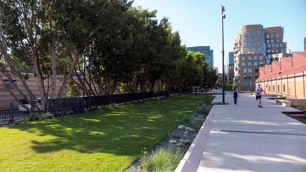
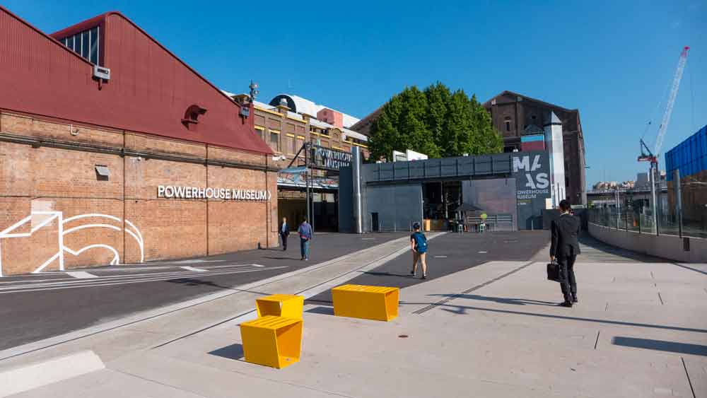
In these two photographs (below) you can see hos this passage fits in with the surrounding neighbourhood. It links this end back through the passage to Central Station.
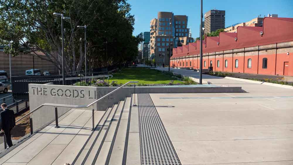
Oh yes, then there was this little creative effort which looks more like an expensive folly. Apparently this will encourage activities by the students from the nearby university – and it will be used as an amphitheatre for film nights. Best of luck with that!
In many places the edges are dangerous. I predict that people with trip and fall down into the lower gardens and then someone will have to spend more money to fix this design fault?
And – oh yes, there’s the remnant rail line down there in the garden. A bit of token heritage archi-park design at work here.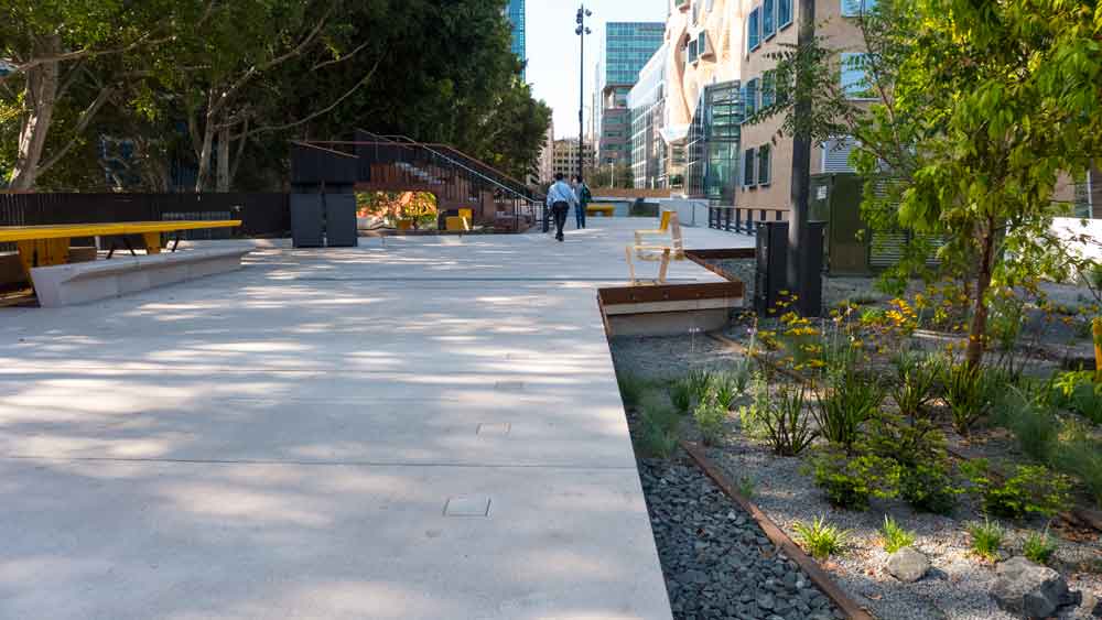
and below is an image of one of the small gardens with more play things. I observed a women using the gym bars in this mini park. I waited till she finished as I could not see how she got in there and where she would exit. In the end she had to step through the plants as there was no path to the equipment. Hmm – seems the designers did not see that one!
And lo and behold during the initial works they discovered some original 19th Century constructions. These were unearthed and was left to illustrate the wonderful heritage of the passage – the goods line. To be honest they was architecturally of little interest and are nothing special. But the signage elevates it into something important to be relished. I suspect people will be underwhelmed and not fall for it.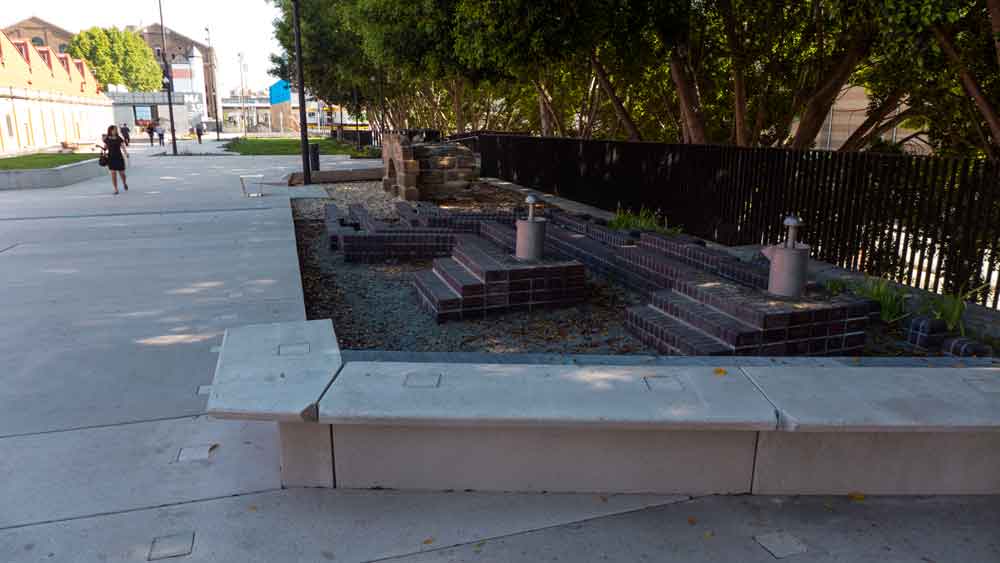
This new archi-park passage has been lauded as ‘The Goods Line’ and a leading piece of landscape architectural design. In fact there is a miniscule amount of the actual line left on the site – with a couple of pieces in one garden.
Meanwhile the real goods line remnant is at the end of the passage nearer to central station. Here there has been minimal design, many more seats and loads of the rail line left visible. The eastern section of the passage is very busy and easy to navigate. 
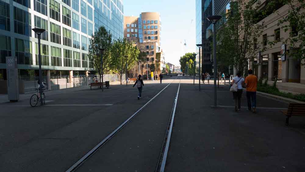
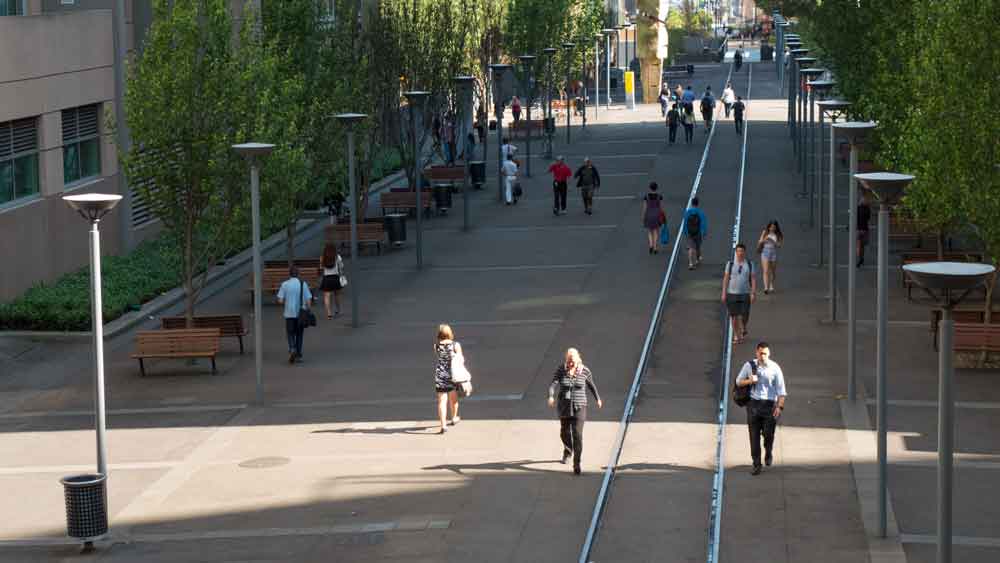
The mystery is that a load of cash was spent on the archi-park (western) end of the passage whereby the eastern end (above) is a very simply designed open space passage – and more friendly as it has loads more seating. I saw it early in the morning so there were few people on the seats. I would expect there to be many sitting around taking time out later in the day.
I would recommend some public art pieces should be commissioned for several locations along both the eastern and western sections of this passage to make the whole thing more interesting.
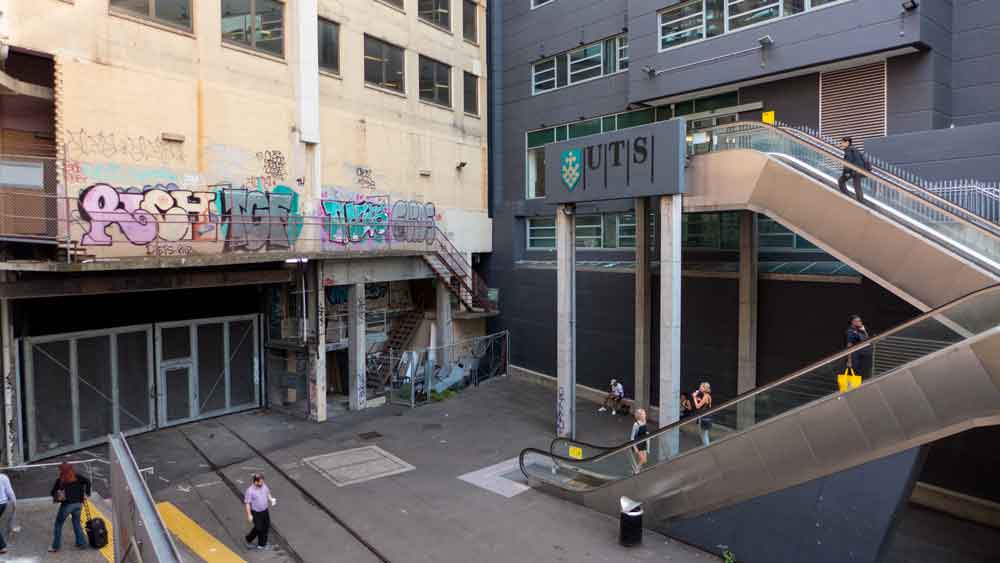
At the far eastern end there is an entrance to UTS which is a mess of graffiti and bits and pieces. This is the entrance that is seen and experienced by the crowds of people as they exit on this side from central station. Yet it is the least attractive.
Meanwhile, down the new archi-park end, I saw someone nearly lose their balance on one of those edges. It will happen!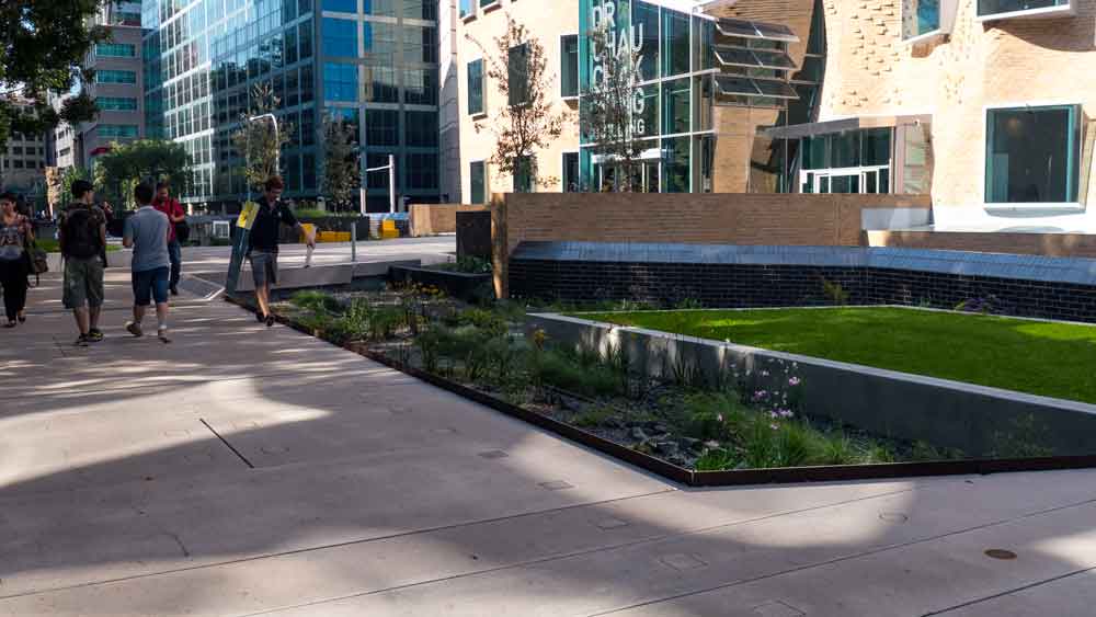
The people marketing this project have drawn a comparison for this short passage with the world leading design triumph of the ‘High Line’ in New York. This is a huge stretch of reality to have made this link.
Here’s a couple of high line links to show how massive a project it is: click here – and then for the wikipedia entry click here.
There is the ‘High Line’ – a world leading design solution for several kilometres of elevated old rail that came about because actions by the local community, and then there is this Sydney small archi-park passage that provides a short passage that joins spaces behind the university.
The goods line is a wonderful way to see the Gehry building. But other than that it is nothing too special while being a convenient pedestrian passage.
Full marks to the agencies that developed the concept to enliven this small passage and to link the different cultural, business, commercial and educational sites. Unfortunately they spent a heap of cash but did not ensure that they were delivered something more attractive – a missed opportunity.
Was there anything good here ? Yes – the original bridge. I am glad that survived. And yes, that line of trees – without them the space would be totally unfriendly. And yes – the potential of the eastern end to be enlivened with some more intelligent creative public art.
My rating: Urbanity Rating 5/10
and maybe that should be 4/10 given the dangerous pieces of design around those gardens and the silly design inclusions of the table tennis toy thing and the strange access to the play equipment and the grass area – and thanks to the local mum for her comments on her children’s adverse reaction to the space – and to the UTS staff member who suggested the passage needed more comfortable seats and more shade.
—————————————–
for more on architecture – click here
Paul Costigan