Review: Landscapes at the Australian War Memorial, Canberra
These comments not are about the exhibitions of the War Memorial. These are comments about the building and recent additions.
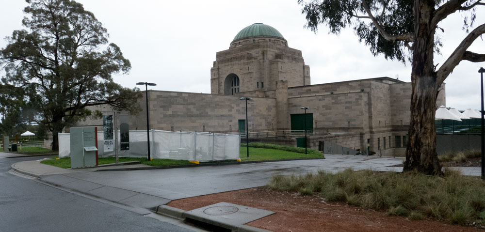
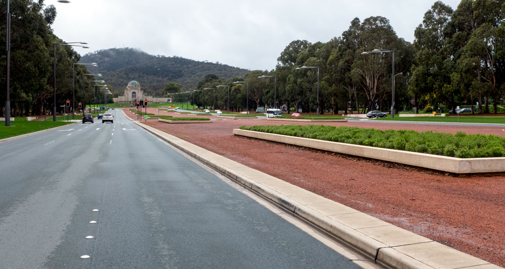
Many times the expression is used when an architect is talking about a building, about how their architecture fits into the landscape. In most cases this proves to be just false architectural spin. However there is one building here in Canberra that does sit beautifully with the landscape. That building is the Australian War Memorial in Canberra
I drive past the memorial on most days. The atmosphere of the mountain and the boulevard leading to it changes depending on weather, time of day and on the activities – or lack of activities. The use of the sandstone – being a soft colour, and the shape of the main building is a real visual pleasure.
I am not one that goes in for all the usual formal stuff in architecture, but for what this building is meant to be about, they really got it right in their choices of construction materials.
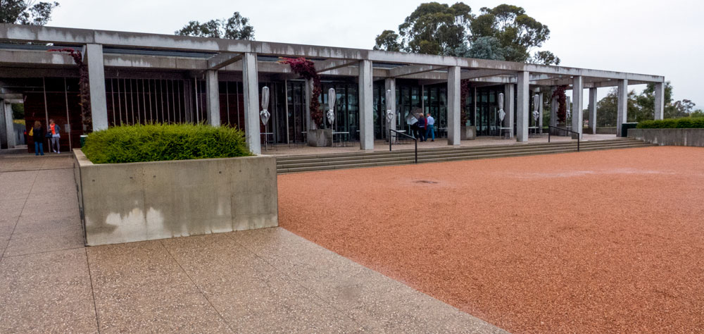
Having said that – here comes some negative stuff. The landscape around this building is so formal that it is almost boring. In recent years there have been additions to the building as well as a new open space added along with a cafe/restaurant.
The architecture of the cafe is simply not compatible with the original building. It is functional and boarders on being ugly. This was a lost opportunity. The building did not need to be in the same style of the main building, but it should have been far more sympathetic or at least interesting. It looks no different from any cheap tourist outlet that may have been built as a contemporary roadside cafe/shed.
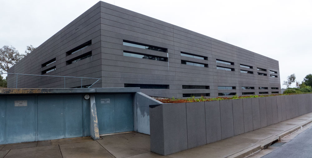
The other new buildings probably won all sorts of accolades for their architectural design. They are not sympathetic with the main building. While the main architecture has a soft and sombre feel to it, these new additions to the rear and side of the memorial have taken on the look of being fortresses and some form of hard-edged battlements. It is as if the new architects wanted to reinforce the nasty side of war rand machines rather than being about a memorial.
And as you can see from the image above – the landscape work, or at least its maintenance, has been shoddy.
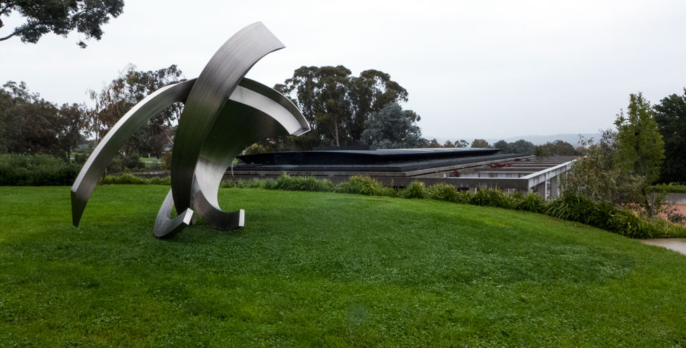
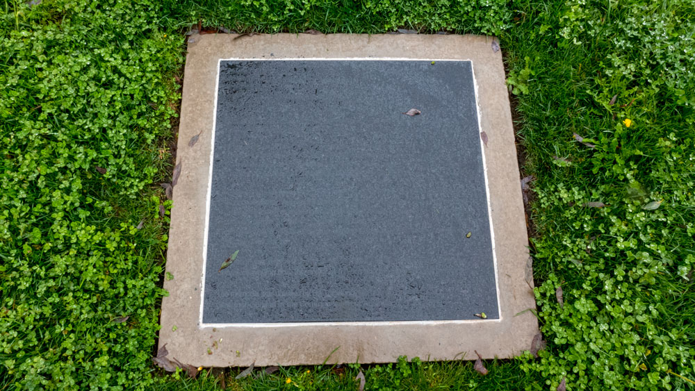
As you can see from these photographs, we were there on a rainy day to meet friends. Before we entered the cafe for lunch, we wandered up the stairs to the left to see what was there. There was an artwork. Sadly we cannot report what the work was about as the plaque in the ground is unreadable when it rains (as it was).
We also noted that restorers were having to work on the artwork down in the open area. (see photo below)
It seemed that maybe the material used was not appropriate. No artist was involved as the artwork came as part of the architectural design. It seems that the architects were pretending to be professional artists. Shame.
The open area is a curious space. I am sure it must be used for something, such as parades, but most of the time it is an open space for no real purpose at all. Another folly delivered by an architectural firm.
Then there were those steps leading up the artwork. An amphitheater maybe but with that hard grey wall blocking the view? Who knows but I am sure the architects would have some symbolic spin to justify this wasted opportunity to have built something of interest.
Lunch at the cafe? Service efficient and friendly. While the food sounded good but was fairly ordinary with lukewarm coffee.
So, back to where I started. The main building remains a wonderful architectural statement. It is a true memorial.
I suspect many people involved now are more about promotion of how wonderful soldiers are and how Australia is such a great nation thanks to all the wars we have been involved in. If only they knew.
I tend to be more on the side of let’s have a memorial such as this as a significant reminder to us all that we should be doing anything and everything to not make all these mistakes again. No more wars – thank you.
As for the recent architectural and landscape additions? Not impressed! and that’s being polite.
And as I have said before – click here – those lights on Anzac Parade have delivered an annoying architectural statement to an avenue with magnificent trees and atmospheres. There was a better and more intelligent solution.
————————————————————-
Paul Costigan, 7 April 2014.


